You may also like

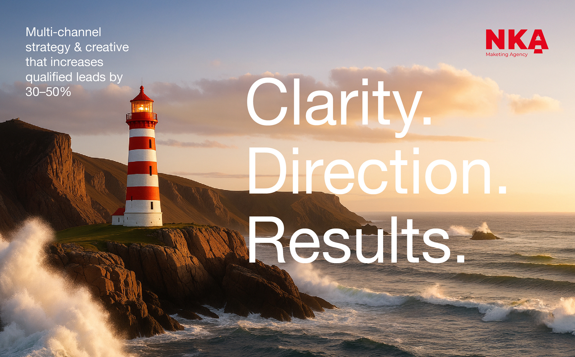
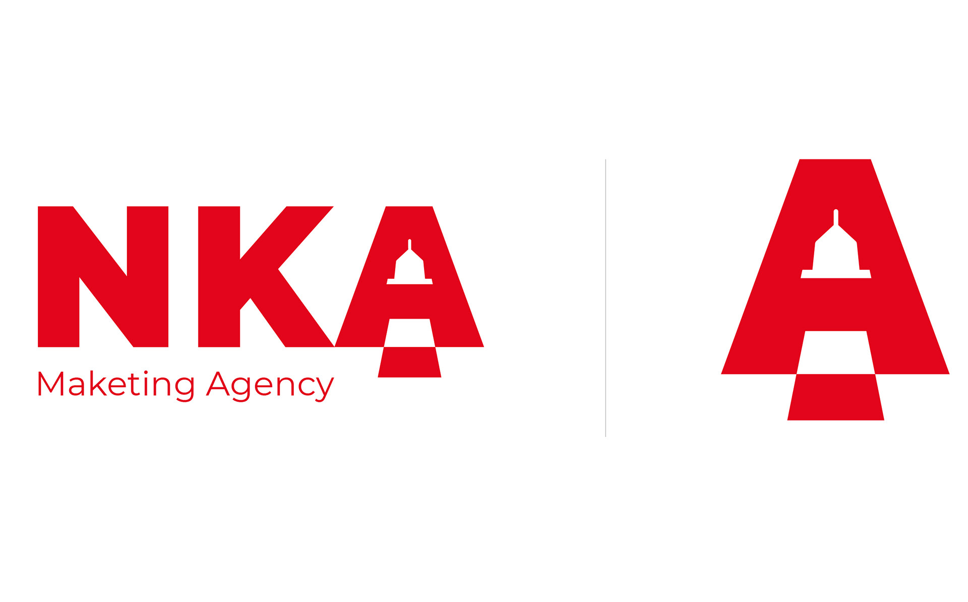
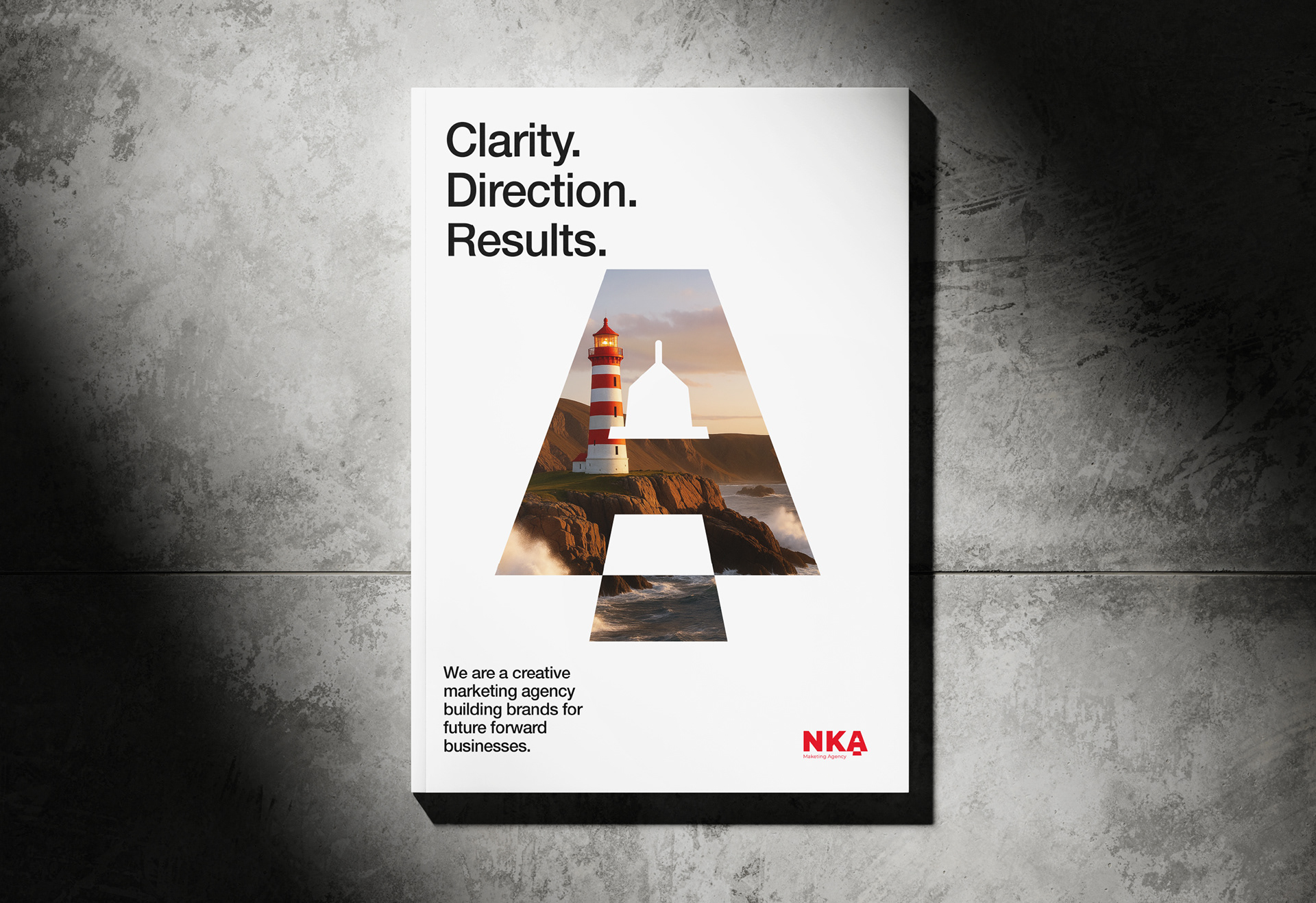
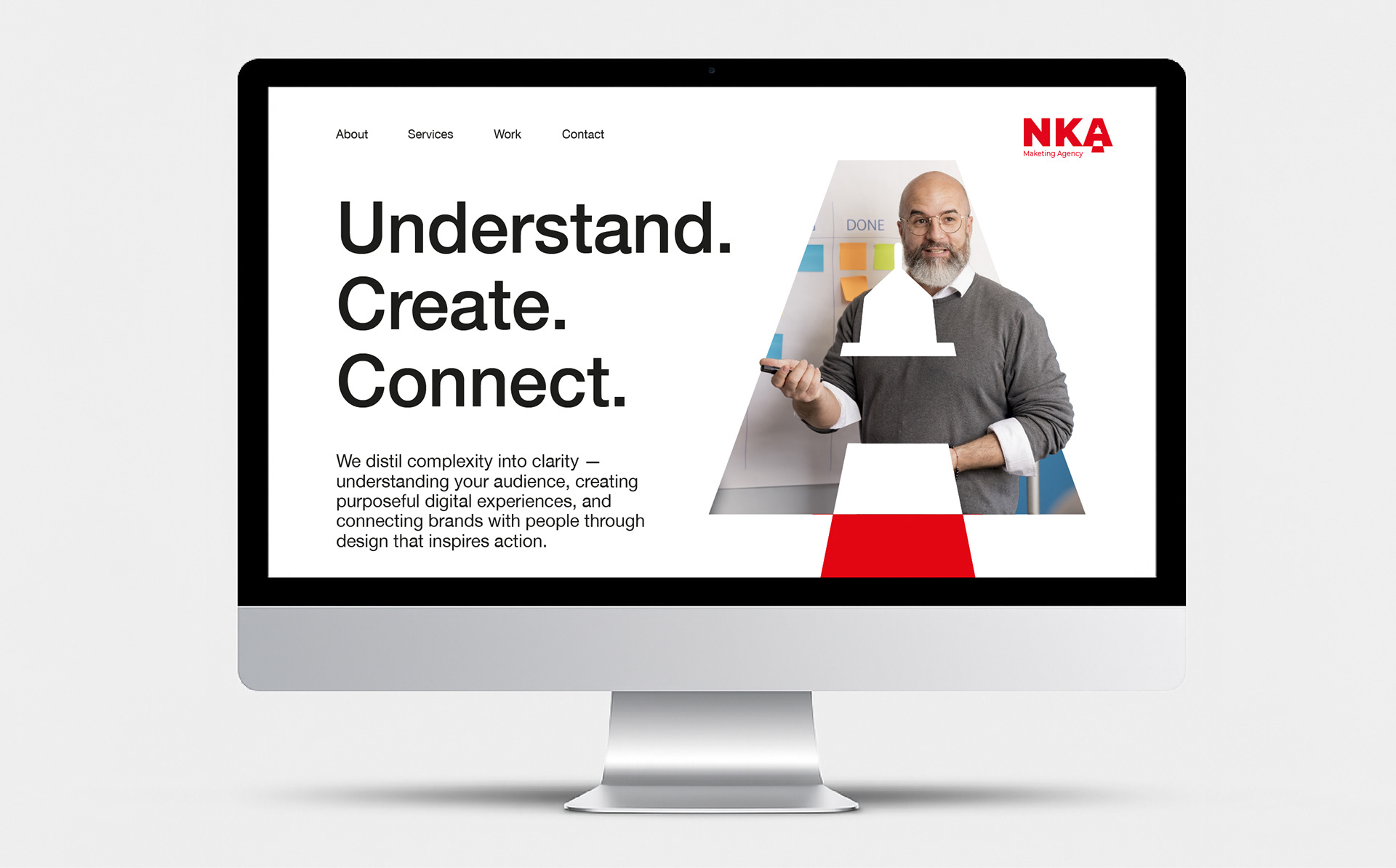
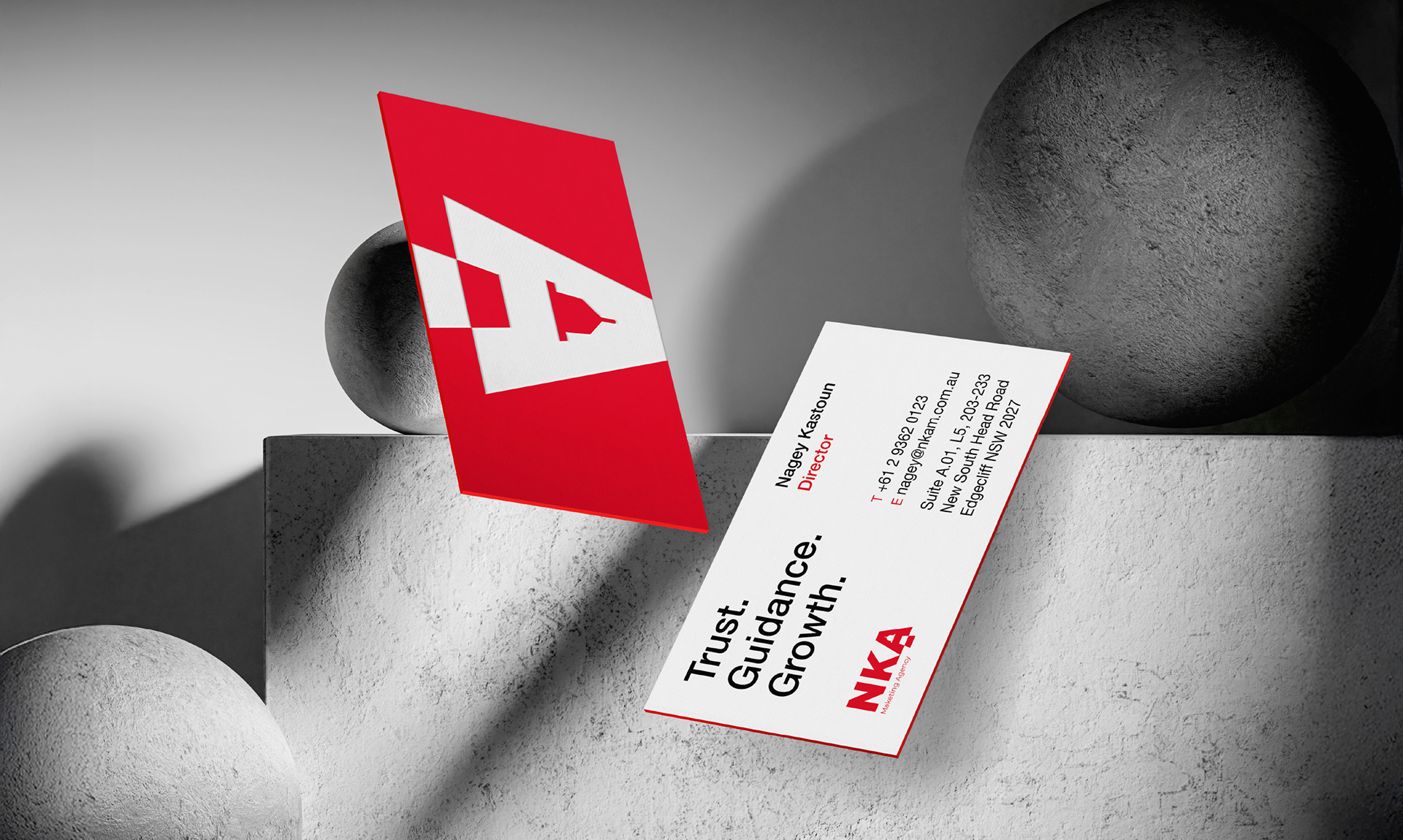
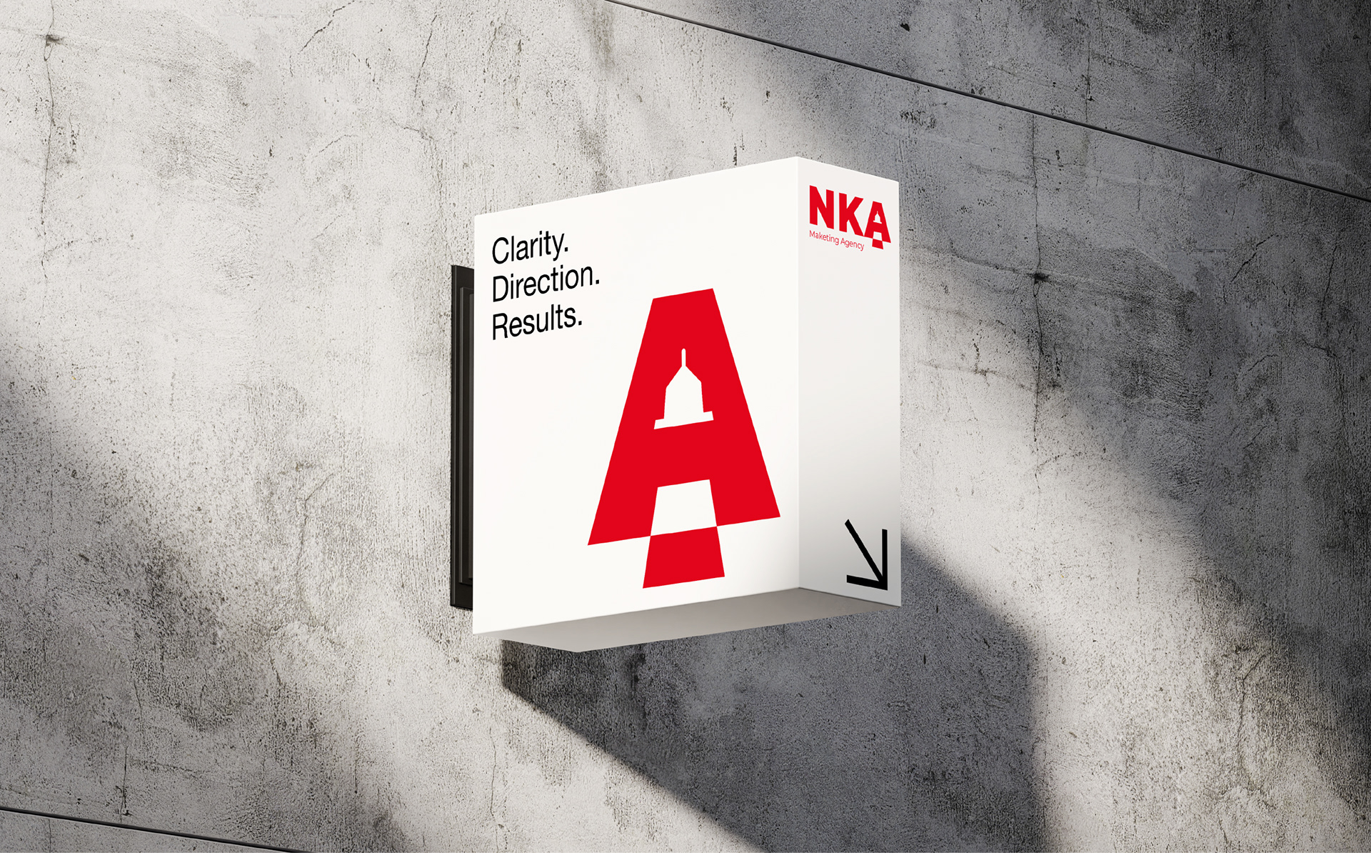
The NKA brand identity draws inspiration from the power of a lighthouse, a timeless symbol of clarity, direction, and guidance. Just as a lighthouse cuts through the fog to guide ships safely to shore, NKA helps brands navigate the often-turbulent world of marketing with confidence and purpose. Every detail of the logo reinforces this story - the bold, red typography reflects strength and visibility, while the lighthouse integrated within the letter “A” shines as a beacon of insight and opportunity. It represents how NKA illuminates the right path forward, helping clients see possibilities they may have missed and steering them toward measurable success.