The person you meet does the work.
Morice leads every project from kickoff to handover. Every brief, concept and pack file is shaped by the person in the first meeting, so the standard holds from pitch to print.
Not in pitches, not in awards, not in moodboards.
On the shelf, at arm’s length, in three seconds.
Twenty years of designing for retail taught us to build for that test first, and to let everything else follow from there. This is how we work, and why.
Morice leads every project from kickoff to handover. Every brief, concept and pack file is shaped by the person in the first meeting, so the standard holds from pitch to print.
Typography, hierarchy, substrate and finish are all judged by how they perform at three metres, one metre and thirty centimetres. Beauty without commercial discipline is decoration.
Twenty years of packs for Coles, Woolworths, Chemist Warehouse, Priceline and Sephora US. We know what a buyer and a printer will ask before they ask it.
Shelf Logic™ is the framework we apply to every project. A pack is read three times before a hand reaches for it. From across the aisle, from a step away, and from the moment it's picked up. Each distance asks a different question. A pack that wins on shelf has a deliberate answer for each one. It's the test every concept passes before it leaves the studio.
From across the aisle, your pack is competing with thirty others as a block of colour and form. Type is unreadable. Detail is invisible. What carries is the shape and the dominant colour. If the pack doesn't read as itself from three metres, the shopper never gets closer.
A metre away, the shopper is scanning. The logo and the product name tell them whose it is and which one it is. Hierarchy does the work. Everything competing for attention dilutes the signal. The job here is recognition, not persuasion. The pack has to register as the right thing before it can argue why.
At thirty centimetres, the pack is in their hand. Now the supporting claims, the quantity and the net weight earn the sale, along with the finish and the back-of-pack story. This is where premium is felt, where trust is built, where the shopper decides to put it in the basket instead of back on the shelf.
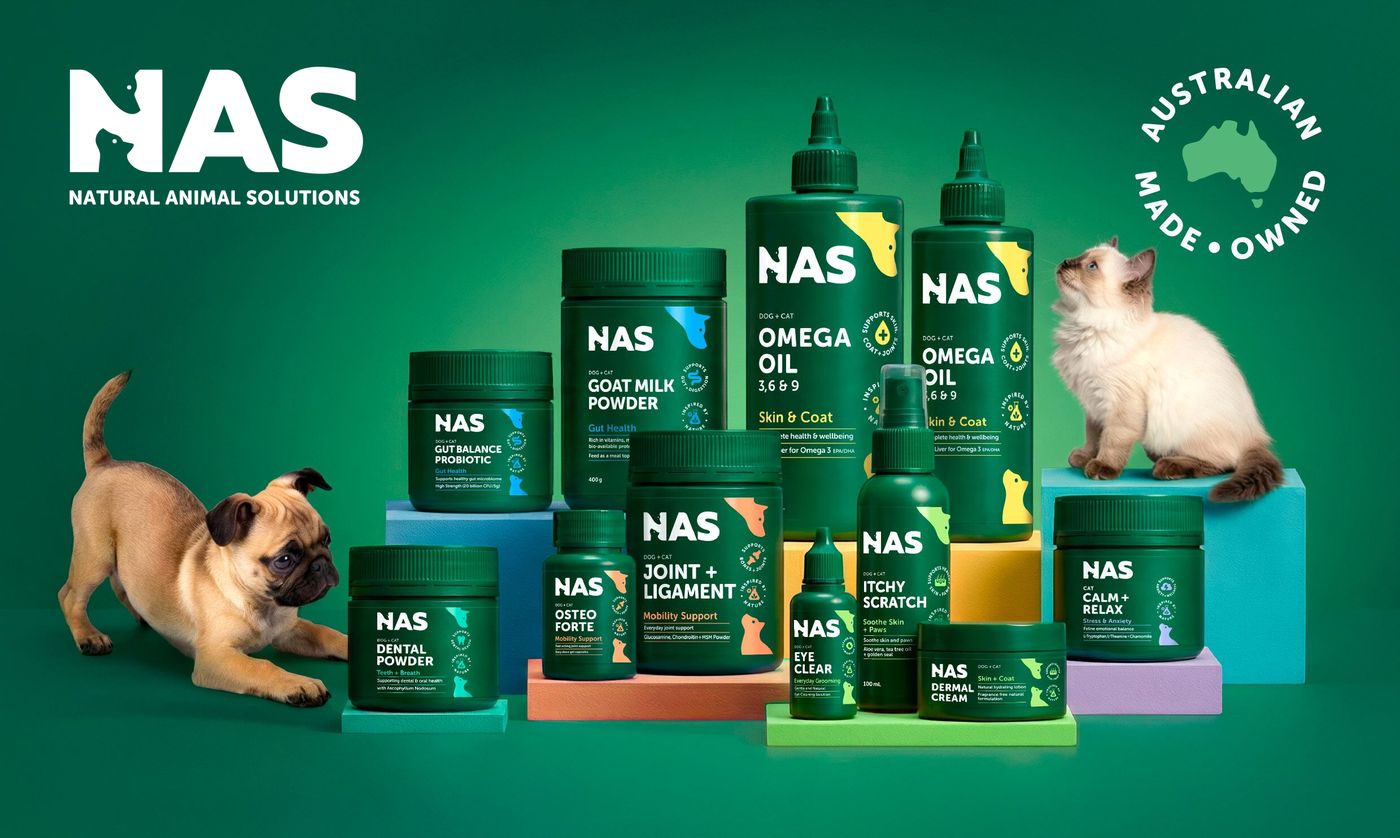
A single block of deep green claims its own run of the pet aisle before a word can be read.
The NAS logo, the need-state product names and their colour coding tell the shopper whose it is and which one they need.
The claims and benefit icons on each pack confirm what it does and close the sale.
We sit down with the brief, the brand, the category, the retailer landscape. We ask the questions most agencies skip. By the end, we know what the work has to do commercially, and what it can't afford to be.
You leave withDiscovery report. Category audit. Design strategy.
We narrow the field. Three or four creative directions, each anchored to a different commercial argument. Not a mood board exercise. A decision-making tool. You leave this stage with the route the brand is going to take and the reasoning behind it.
You leave withCreative routes. Design rationale. Shortlist recommendation.
The chosen route gets built out across packaging, brand system, and supporting assets. Every artwork file is print-ready and manufacturing-aware. Substrate, varnish, foil, embossing, regulatory copy. All thought through before it leaves the studio.
You leave withFull packaging suite. Brand guidelines. Asset library. Production files.
We support launch, retailer pitch materials, range extensions, and asset reuse. Most agencies disappear at handover. We treat the launch as the start of the brand's working life, not the end of the project.
You leave withPitch decks. Retailer sales sheets. Range architecture for future SKUs.
One studio rate for every project, used to build the quote.
You approve the scope and the price before any work starts.
Scope, timeline, deliverables and investment, after one conversation.
The practical mechanics of working with the studio. What gets delivered, in what order, and who is on the work.
Our framework for designing packs that win on the actual shelf and not in a moodboard. Every decision is tested against how the pack reads from three metres, one metre and thirty centimetres. Twenty years of designing for Coles, Woolworths, Chemist Warehouse and Priceline built it.
Four stages: Listen, Sharpen, Make, Ship. Each ends with a defined deliverable and a signed-off decision before the next begins. The full picture lives above.
Shape and colour that read from three metres. A logo and product names that land at one metre. Supporting claims, quantity and weight that close the sale at thirty centimetres, in the hand. The work is judged on shelf, not on screen.
Twenty years of shipping through Australian category review. Retailer compliance, planogram and category management requirements are designed in from the brief, not bolted on at the end. When feedback comes back we translate it into decisions that protect the brand.
Both. Every project starts with strategy. Positioning, category audit, shopper context, brief. The design follows from the thinking. Studios that skip this step ship packaging that looks good and sells badly. We are not interested in that work.
Morice leads every project from kickoff to handover. Every concept, every refinement and every production decision has his hands on it.