Cenovis.
Wellness · Heritage Rebuild
Cenovis has stood on Australian medicine cabinets since 1936. Heritage equity that's hard to manufacture and easy to dilute. By 2022 the brand had let its expression lapse against a category that had filled with new entrants chasing colour and noise. The brief: bring Cenovis into the present without erasing what made shoppers reach for it. Created in collaboration with Cowan.
Modernise the heritage without losing it.
Wellness has exploded with new brands. Most loud. Most chasing the same minimal aesthetic. The category looks louder than it has ever been, and quieter than it has ever been, at the same time. Cenovis sat in the middle. Recognised by almost everyone, refreshed by almost no one. The risk wasn't doing nothing. The risk was doing the wrong thing.

Heritage in wellness reads as proof.
When a new brand makes a claim, the shopper has to be convinced. When Cenovis makes a claim, the shopper has already heard it from their grandmother. That kind of trust takes generations to build and a single rebrand to break. The strategic question wasn't 'how do we modernise the logo?'. It was 'how do we codify the system so every future SKU benefits from the heritage we already have?'
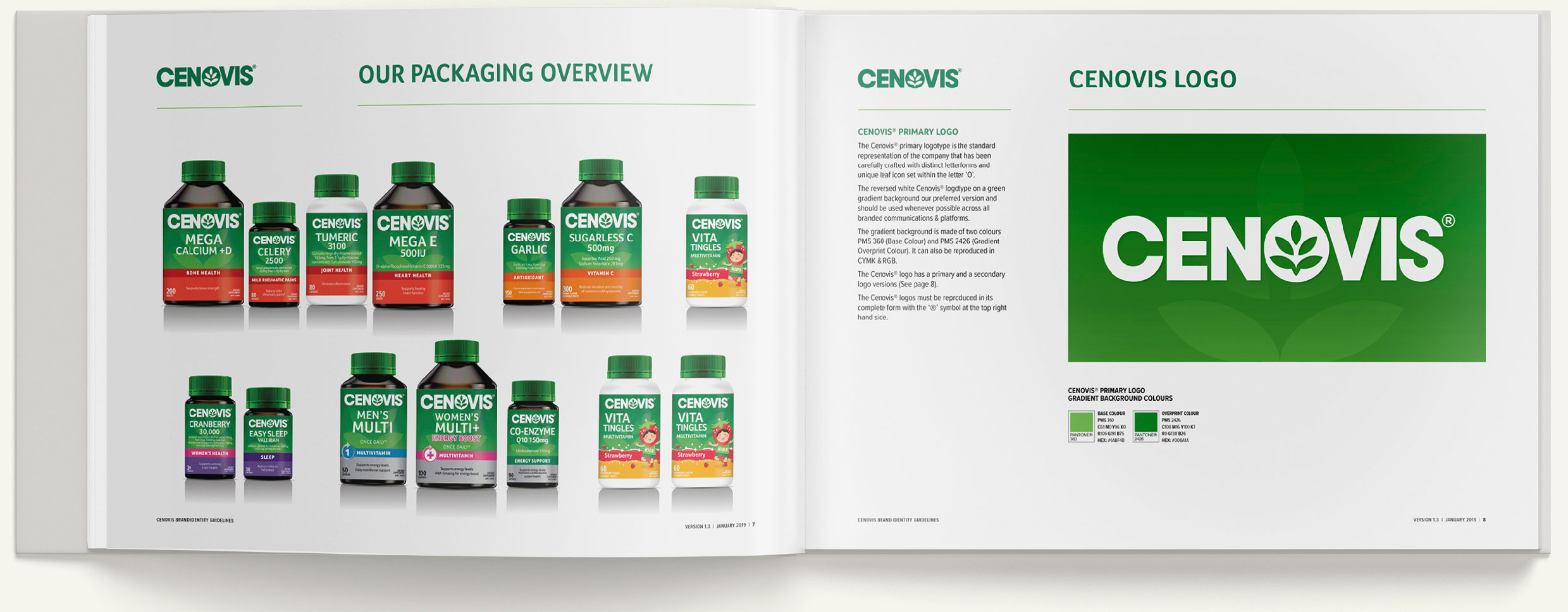
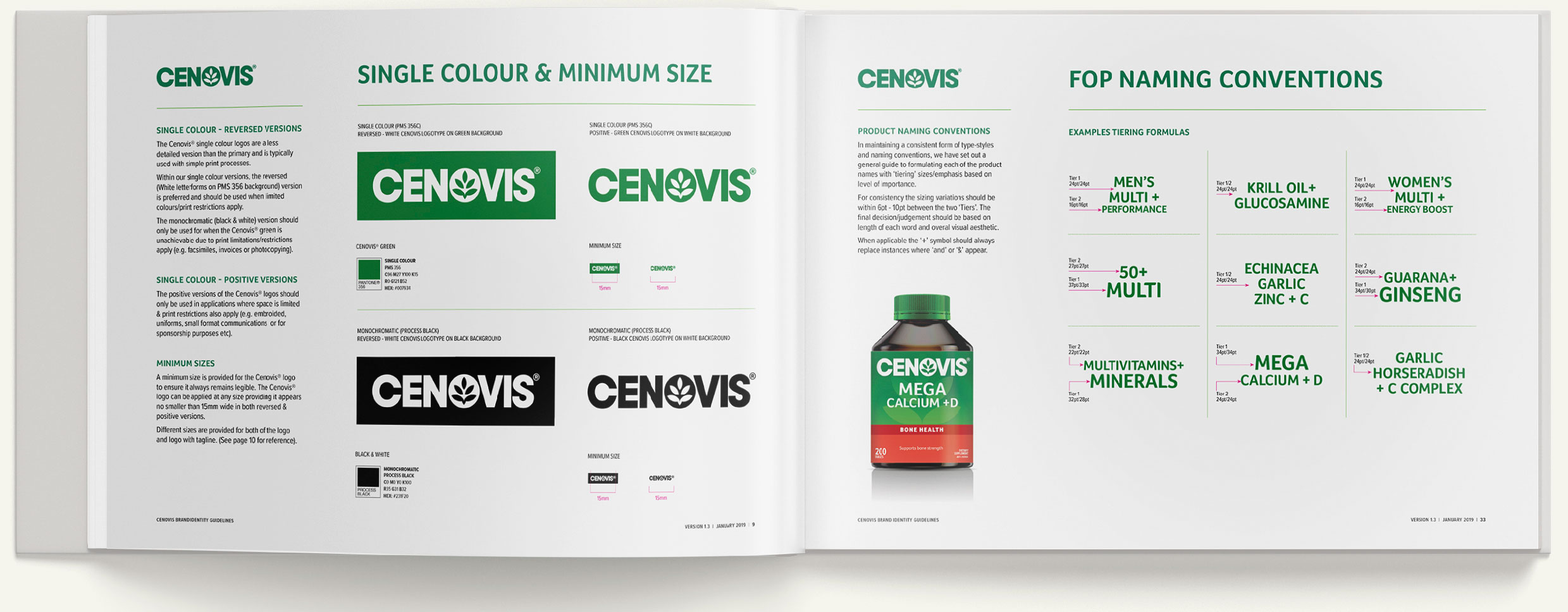
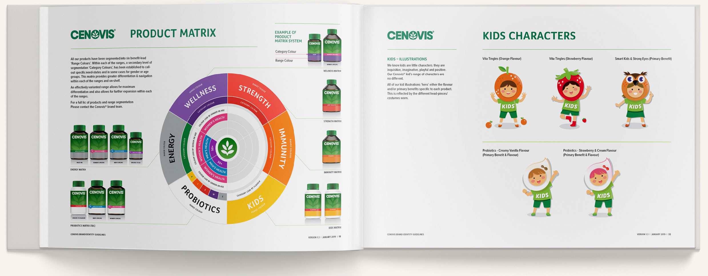
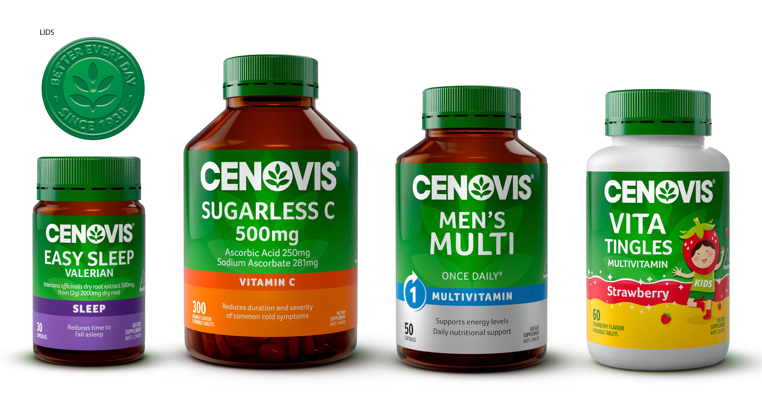
Build the system, not just the mark.
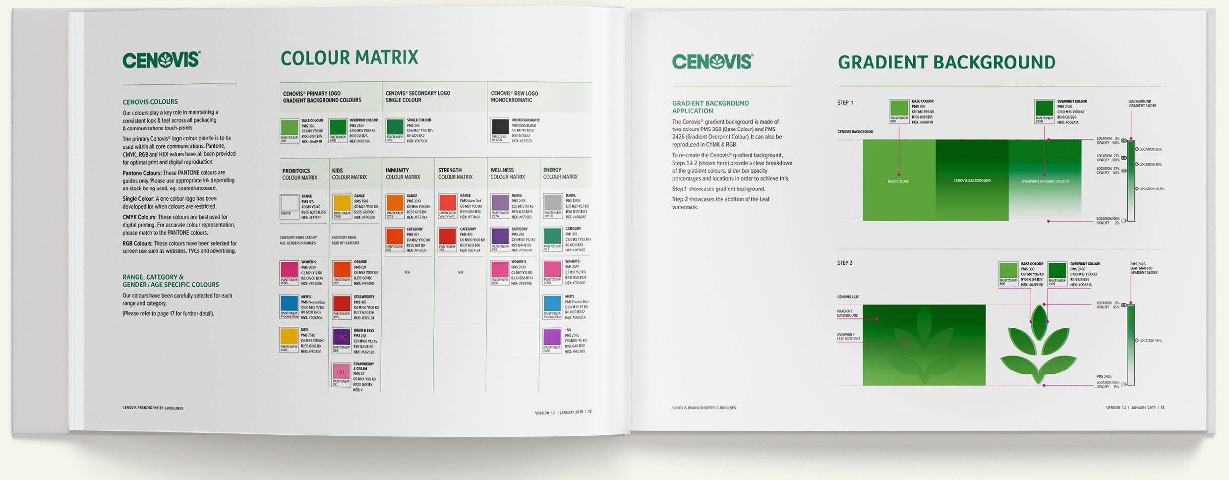
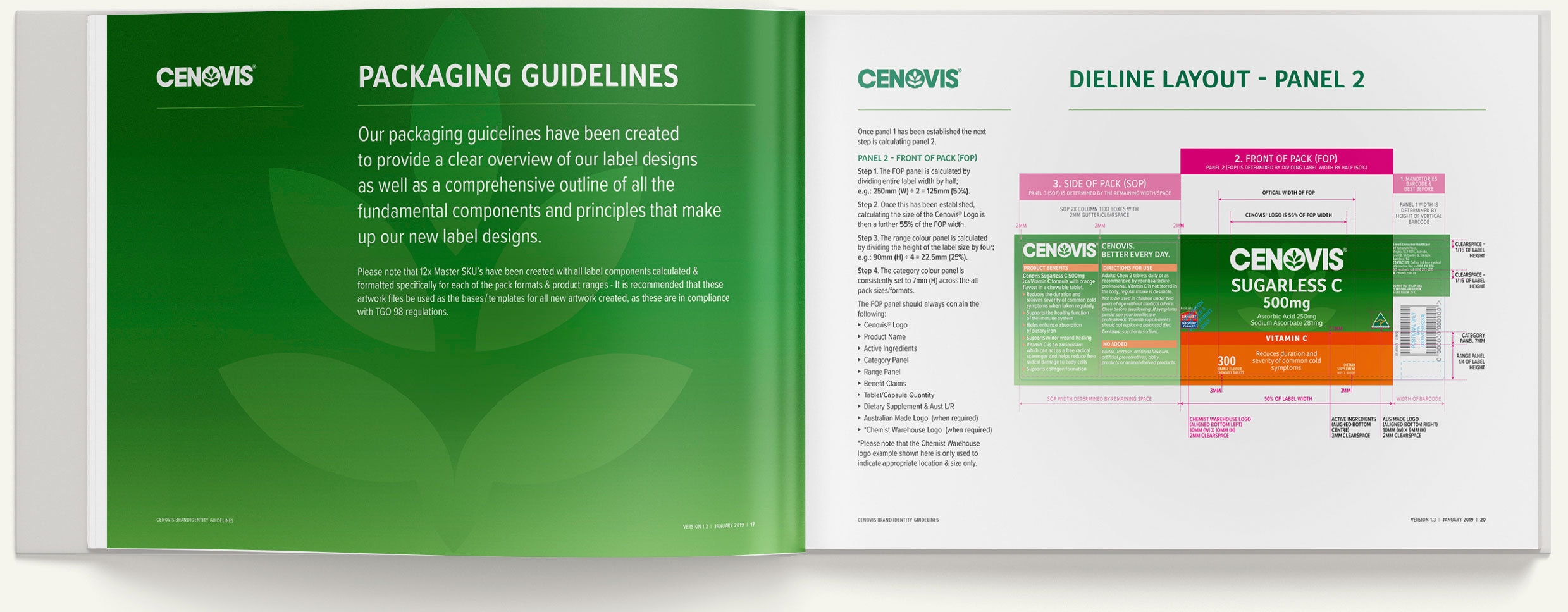
We didn't redesign the brand. We rebuilt the architecture that explains it. Every colour, every margin, every typographic decision lives in a single book that any future designer, printer, or marketer can build against. The mark stayed. The system around it became the work.
“Heritage brands don't get rebuilt by reinvention. They get rebuilt by codification. Cenovis didn't need a new look. It needed a system that could carry its heritage forward.”