NKA.
Marketing Agency · Brand Identity
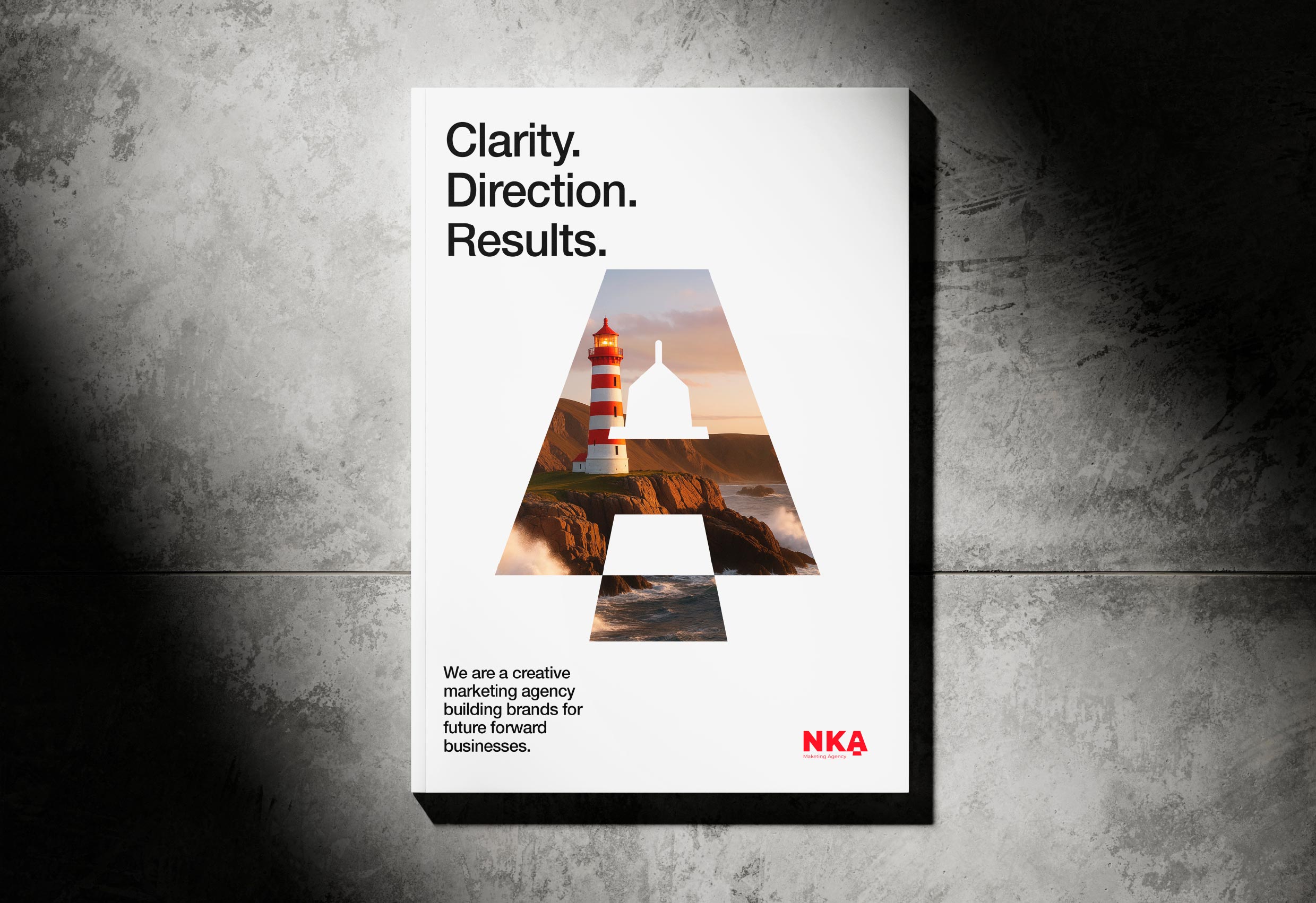
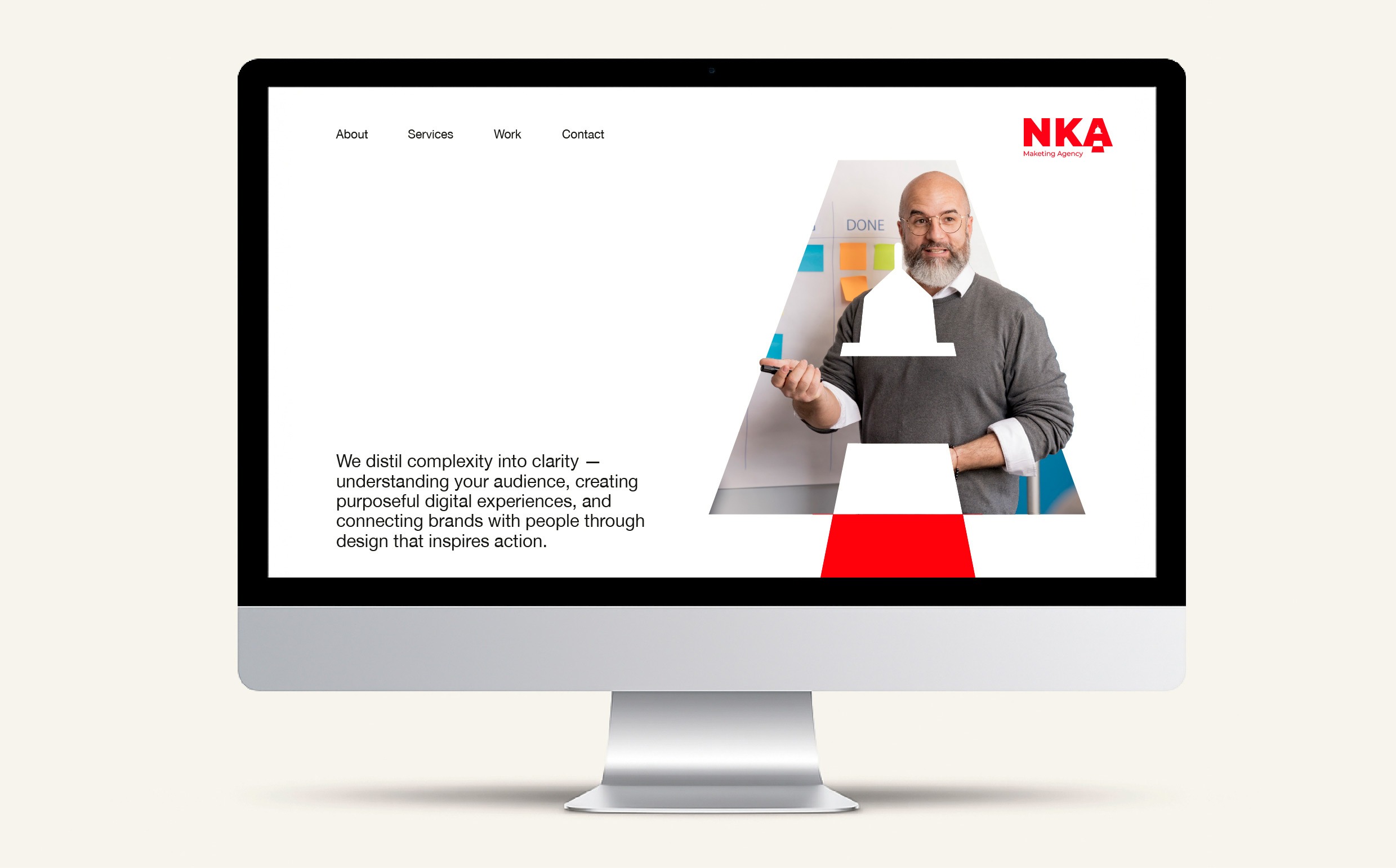
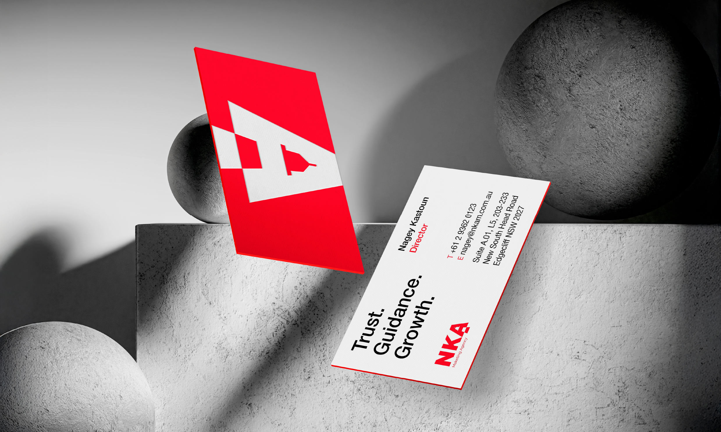
The NKA brand identity draws inspiration from the power of a lighthouse, a timeless symbol of clarity, direction, and guidance. Just as a lighthouse cuts through the fog to guide ships safely to shore, NKA helps brands navigate the often-turbulent world of marketing with confidence and purpose. Every detail of the logo reinforces this story. The bold, red typography reflects strength and visibility, while the lighthouse integrated within the letter 'A' shines as a beacon of insight and opportunity. It represents how NKA illuminates the right path forward, helping clients see possibilities they may have missed and steering them toward measurable success.
A mark that matched the work.
NKA is a Sydney marketing agency built on clarity, insight, and direction. Clients come to them when the noise gets too loud. The existing brand did not signal any of that. The brief was a complete identity rebuild. A mark that earned attention. A system that scaled across every touchpoint. A story strong enough to anchor the agency for the next decade.
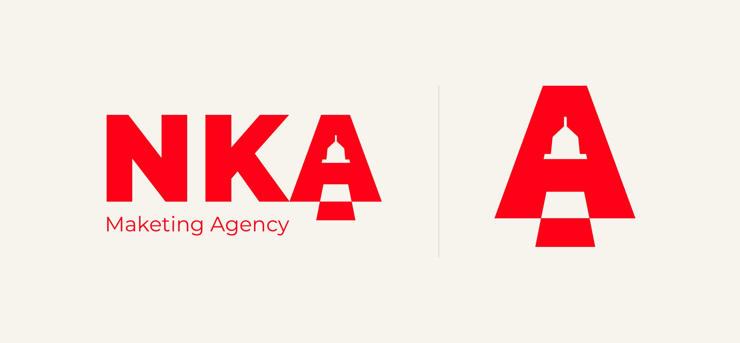
A lighthouse, hidden in plain sight.
The metaphor came from how NKA actually works. Cut through the fog. Find the safest line. Light the way. The lighthouse made it into the letter A. Present, but quiet enough that the wordmark reads first. Bold red typography carries the weight. The lighthouse holds the meaning.
Built to scale across every surface.
A logo is one piece. NKA needed a full brand system that worked at boardroom scale and business-card scale. Editorial design, signage, stationery, web, and a custom data-visualisation language for client decks. Every touchpoint reinforces the same idea. Clarity, direction, measurable progress.
Visual language for the work.
NKA does the analytical work behind their clients' marketing decisions. The data needed to feel native to the brand, not borrowed from a stock chart library. We designed a custom pie chart, segment, and line graph system in the brand red and supporting palette. When an NKA pitch deck or report lands on a desk, the analysis looks like NKA the moment it opens.