Seven retailers, one shopper.
The Australian beauty market runs across a fragmented retail landscape. Chemist Warehouse dominates mass beauty by volume. Priceline holds the mass beauty and haircare specialty. Mecca and Sephora US own prestige beauty, each with their own tightly-curated ranges. Myer holds department store prestige. Big W and Amazon handle value beauty at scale. Each retailer has its own category buyer, its own margin logic, its own shelf conventions, its own consumer profile.
The trap for beauty brands is designing for one retailer and hoping the pack translates to the others. It rarely does. A pack that reads as premium in Mecca can read as pretentious in Chemist Warehouse. A pack that pops in Chemist Warehouse can look loud in Mecca. The brands that scale in Australia design a system that dials up or dials back depending on the shelf environment, without ever losing the identity that makes the brand recognisable.
Beauty has trained itself into visual conformity.
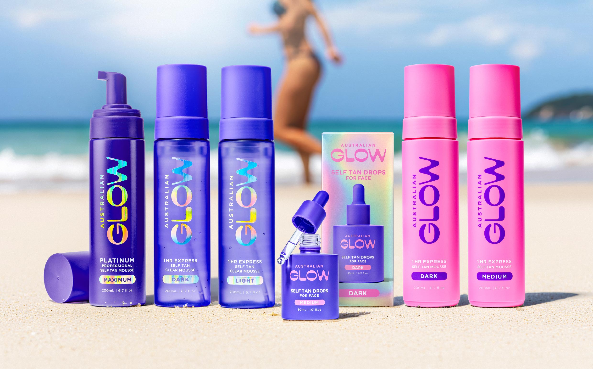
Walk any beauty aisle and the visual range collapses fast. Polished bottles. Restrained typography. Pastel or gradient colour palettes. Tasteful minimalism. The category code says premium. The shopper sees same. Australian Glow's brief was to look nothing like the rest of the self-tan bay. The design answer was to build architecture that carried the range identity while letting each SKU own a distinct visual role. Chrome. Cobalt. Cyan. Each bottle signalling its role before the shopper picked it up.
The lesson generalises. Beauty categories converge on aesthetic conventions because designers reach for the same reference points. The way to win is to identify the convention, understand why it exists, then break it deliberately with a system that holds. Not chaos. Not novelty for its own sake. A considered break, executed with the same discipline as the convention it replaces.
Bottle, tube, sachet, jar.
Format is a strategic decision as much as a structural one. Bottles carry premium cues but demand better shelf economics. Tubes are functional and travel-friendly, and they discount well. Sachets are trial-oriented and open ecommerce doors. Jars carry luxury cues but face regulatory scrutiny on formulation stability. Every beauty range holds two or three of these formats at once. The system has to unify them without homogenising them.
The best beauty ranges treat format diversity as an expressive tool. Different formats carry different weights of the brand system. The hero bottle carries the full identity. The tube version reduces to the essential. The sachet is the brand mark plus a claim. Getting this ladder right is what makes a range feel deliberate rather than accidental.
Colour does more work in beauty than in any other category.
Beauty shoppers navigate colour before they navigate typography. Colour signals category, sub-category, benefit, tone, and price tier, often all at once. A gold accent on a beauty bottle can add fifteen dollars of perceived value. A pastel colour palette can move a brand from prestige to mass in a single decision. Category disruptors typically break the colour convention first, then build the rest of the system around the colour position they've claimed.
The discipline is holding the colour position across a range. Australian Glow uses a coded palette across its self-tan range, one distinct colour per intensity, all sitting within a coherent overall brand system. A shopper standing at the fixture can navigate the range without reading a single word. That's colour doing its job.
The sustainability minefield.
Sustainability signals are now table stakes in beauty packaging, but they're also the fastest way to trigger a greenwashing accusation. Consumers, regulators, and retailers are all more sceptical than they were three years ago. Recyclable, refillable, sustainably-sourced. Every claim needs to be defensible with real substrates, real supply chain, and ideally real certification.
The best beauty brands treat sustainability as a genuine constraint on the packaging brief rather than a label to add at the end. Choose the substrate first. Design the format around what can be refilled. Match the closure to what can actually be recycled. Only then work up the visual claims that reflect what's genuinely true. This ordering produces packs that stand up to a category buyer's questioning and a consumer's fine-print reading.
What makes Australian beauty different.
Australian beauty has a distinctive point of view. Sun exposure, dry climate, active outdoor lifestyle, and multicultural skin types have shaped a category more oriented around function, everyday use, and unpretentious confidence than the European aspirational aesthetic or the American celebrity-brand model. Brands like Australian Glow lean into that positioning explicitly. The Australian self-tan promise isn't glamour. It's sun-kissed, unapologetic, everyday.
This regional identity is an underused competitive advantage. Global beauty is exhausted with polished aspirational imagery. Australian brands that dial into confidence rather than aspiration read distinctly on international shelves. Sephora US selection panels have been picking up Australian brands specifically for this differentiation. The pack has to signal it before the shopper reads the country of origin.
Category depth compounds even harder here.
- Look for beauty range case studies with multiple SKUs across multiple formats. Beauty is a system-first category. Anyone can make one bottle look good. Building a coherent range across bottles, tubes, sachets, and jars is a different discipline.
- Ask which beauty retailers the studio has shipped through. Priceline, Chemist Warehouse, Mecca, Sephora US, Myer each have their own artwork spec sheets and category buyer preferences. Experience matters.
- Ask about substrate and print production capability. Beauty packs live and die by finish. Foil stamps, spot varnishes, embossing, tactile substrates. A studio that treats these as afterthoughts ships a pack that reads flat on shelf.
- Look for regulatory literacy. Beauty claims are among the most regulated FMCG categories in Australia and internationally. On-pack copy has to be defensible in every market the range enters. Studios that don't take this seriously ship packs that get pulled from shelf.
Beauty packaging is craft as commercial strategy.
In beauty, packaging is the product to the shopper. What's inside the bottle matters, but the shopper's first commitment is to the object itself. The unboxing, the weight, the closure sound, the label finish, the shelf-visible signal of who this brand is for. Every one of those decisions is a design decision. Every one contributes to whether the pack gets picked up or passed over.
Beauty brands that treat packaging as decoration ship packs that need advertising to explain them. Beauty brands that treat packaging as the primary brand experience ship packs that do their own selling. Australia has enough shelf saturation now that the second approach is the only one with staying power. The Australian brands that break through globally in the next decade will be the ones with genuine packaging craft holding the whole brand together.