The pack that looks brilliant in the boardroom.
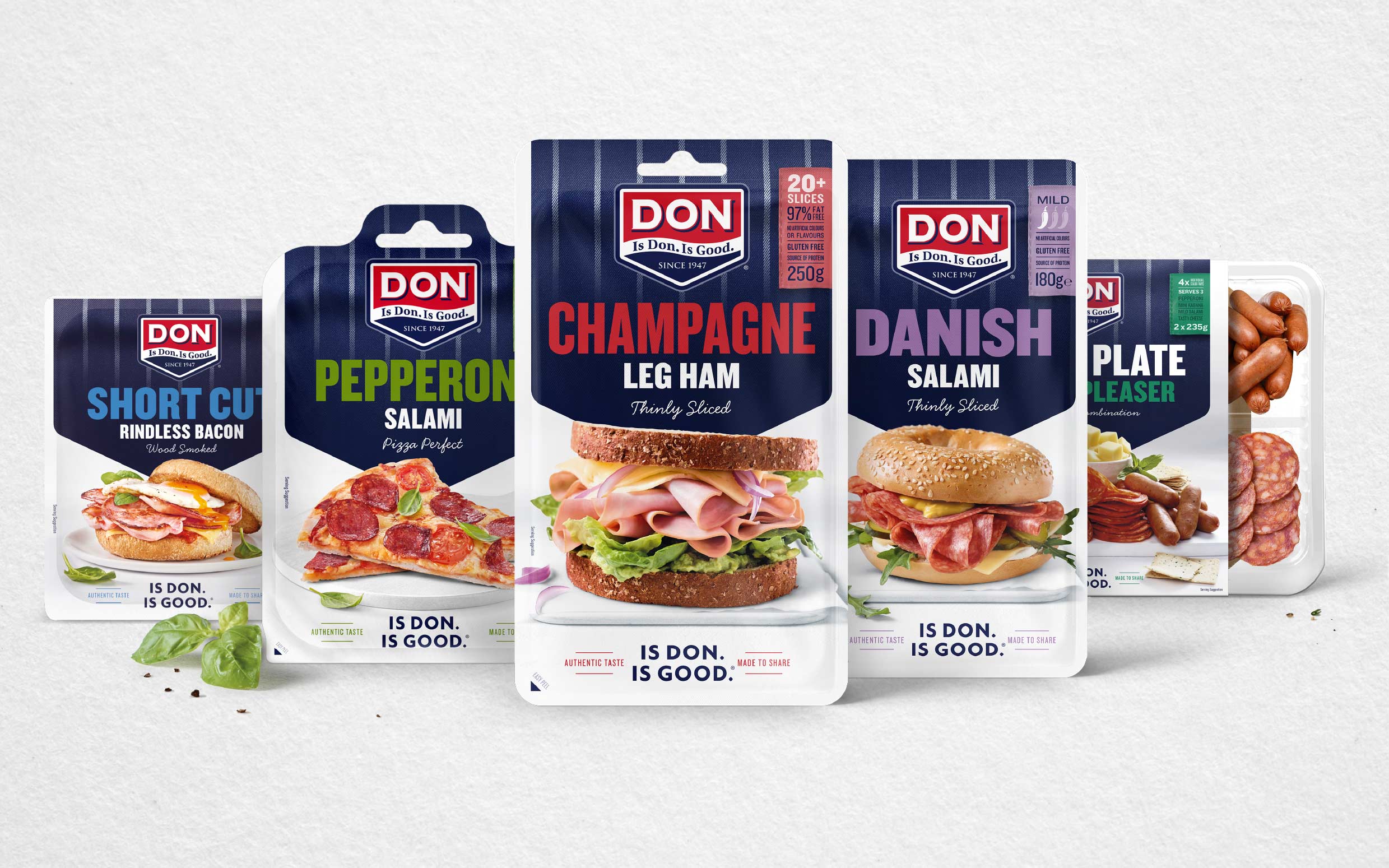
A pack designed on a laptop screen at 100% zoom, printed on high-quality office paper, and presented in a slide deck almost always overperforms. Colours look richer. Type looks crisper. Detail looks intentional. Then the pack ships to a supermarket shelf under fluorescent lighting, printed on flexible film with a 3-4mm bleed tolerance, sitting between two competitor brands, and everything that looked considered in the deck now looks either invisible or overwrought.
The cost. First shipment gets weak sell-through, category buyer flags underperformance at first quarterly review, delisting conversation starts within twelve months. Cost to reprint and rebrand: typically AUD $30,000 to $150,000 depending on range size.
The fix. Design at print resolution, on the actual substrate, and pressure-test every pack at shelf distance before final approval. This is what Shelf Logic exists for: the studio's proprietary three-distance test (4m, 2m, 30cm) ensures no pack leaves without shelf verification.
The ingredient panel that ate the design.
Regulatory copy (ingredient percentages, allergen callouts, country-of-origin labelling, nutrition panels, health-star ratings, therapeutic claim caveats) is often left until the end of the design process. The designer creates a beautiful front-of-pack. The compliance team then requires 40% more copy than the design accommodates. The compromise is either an uglier pack or a re-designed pack.
The cost. Design revision cycle adds 1-3 weeks. If it happens at pre-press, printer holds a slot that becomes a rush job. Rush-job fees typically add 15-30% to print costs. Worst case, the compliance revision misses the retailer's approval window and the launch pushes to the next category-review cycle (three to six months).
The fix. Build the regulatory copy real estate into the design from the first concept. Every mandatory element gets allocated space before any visual treatment happens. A senior studio treats compliance copy as part of the design brief, not fine print.
The single SKU that never scales.
A hero SKU designed in isolation looks great. Then the founder decides to launch three variants. Then five. Then ten. Every extension requires a bespoke design decision because the original brand system was not built to scale. Variant coding contradicts across SKUs. Colour hierarchy breaks. On-shelf, the range looks like separate brands.
The cost. Every unplanned range extension costs 40-70% more than one designed within a coherent system. Category buyers penalise incoherent ranges in category reviews. Shopper navigation of the range slows, sell-through drops, and by SKU ten the brand needs a full system rebuild.
The fix. Design the range architecture at project kick-off, even if only one SKU is launching. A senior studio thinks in systems, not packs. Providore for Dogs and Australian Glow are both designed as range architectures. Every future variant slots into the same coded system without a redesign.
The false economy that scales.
Cheap printers cost less per unit. They also produce more colour drift between runs, more registration errors on multi-colour work, more foil failures, and looser tolerance on die-cut and creasing accuracy. Every pack looks slightly different depending on which print run it came from. On a supermarket shelf where three variants of the same brand sit next to each other, the shopper reads variation as counterfeit or poor quality.
The cost. Depends on scale. On a mid-range launch (5-10 SKUs, 50,000 units total), the savings from choosing a cheaper printer over a considered one is typically AUD $5,000-15,000 total. The retailer complaints, the category-buyer review conversations, and the reprints that follow typically add up to $30,000-80,000 in downstream cost. Net loss.
The fix. Choose a printer who has shipped your category before, has references you can call, and whose colour management demonstrably holds across runs. A senior studio has printer relationships and can broker introductions. Your best print supplier is not the one with the lowest quote.
The imitation that guarantees invisibility.
The most tempting mistake. The category leader is doing well. Their pack has certain visual cues. Copy those cues, and shoppers will assume similar quality. This logic is intuitive and completely wrong. Shoppers navigate categories by pattern recognition. Packs that look similar to the leader read as substitutes. Substitutes get priced lower and shelved lower. The pack that copies the leader competes as a discount alternative.
The cost. Impossible to command a premium price. Retailer buyer conversations default to "why not just buy the leader". Shopper trials stay low because the pack does not offer a distinctive reason to try.
The fix. Break the category convention deliberately, executed with the same craft as the convention you are replacing. Australian Glow deliberately broke self-tan category conventions with distinctive bottle architecture and coded colour. That is what made it recognisable in Priceline and got it into Sephora US.
All five mistakes share one root cause.
Every one of these mistakes traces back to treating packaging as a design task rather than a commercial system. Design for the deck, skip compliance, ignore range architecture, choose the cheap printer, copy the leader. All of them are decisions that look reasonable at project start and cost real money on the P&L eighteen months later.
A senior FMCG studio's whole job is to prevent each one. The premium you pay for that discipline is small compared to the cost of any single one of these mistakes at scale.