A category defined by a promise, not a product.
Functional beverage is any drink that carries a benefit claim beyond hydration or refreshment. Digestive health (kombucha, kefir, prebiotic soda). Cognitive function (mushroom coffee, adaptogenic drinks). Energy or focus (nootropic drinks, functional coffee alternatives). Recovery and hydration (electrolyte mixes, functional waters). Immunity (elderberry, echinacea, vitamin-fortified drinks). Even the beer category has produced functional variants now. Low-carb, low-alcohol, gut-friendly, protein-fortified.
What unifies the category is not the product type but the promise. The shopper is choosing this beverage instead of a conventional one because it does something for them. That mental model changes every design decision. The pack has to earn the swap. It has to convince a shopper standing in front of a familiar Coca-Cola or a familiar Corona to try something they've never tasted, at a higher price point, on the assumption that the promise will hold up.
Health, wellness, and the death of the middle.
Australian consumers are drinking less alcohol per capita than any point in the last thirty years. They're drinking less soft drink. They're drinking more water, more coffee, more tea, and more functional beverages. The middle of the drinks aisle (mainstream soft drinks, mid-strength beer, ordinary juice) has been squeezed from both sides. Water and functional drinks are eating from below. Craft, premium and functional are eating from above.
Retailers have responded by expanding the functional beverage set aggressively. Coles and Woolworths have both restructured their beverage aisles in the last two years to give functional drinks more facings. Specialty grocers, health food chains, and DTC subscription boxes have built entire businesses around the category. This means the shelf environment is more competitive than it's ever been. The bar for stand-out is higher. The margin for design compromise is smaller.
The functional beverage visual template.
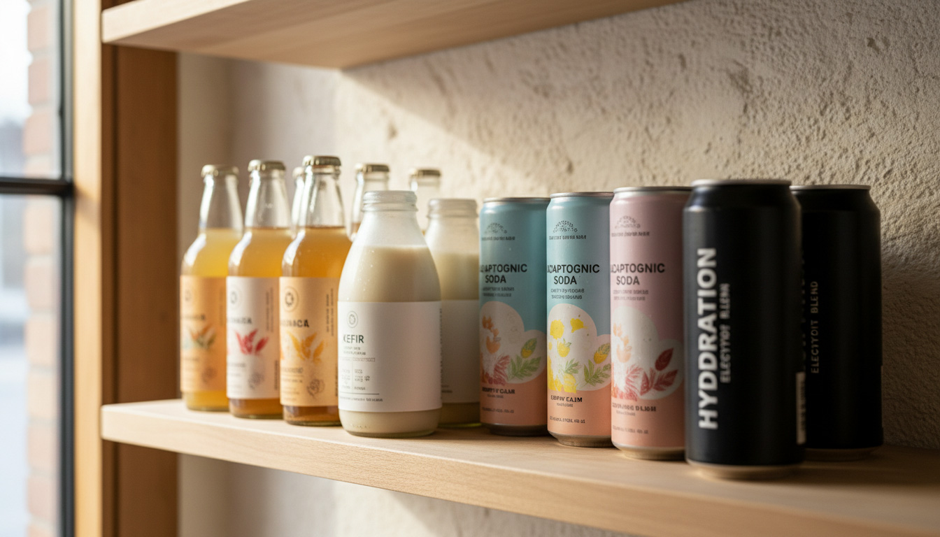
The functional beverage category has developed its own visual conventions in a very short time. Minimalist typography. Off-white or cream backgrounds. Bold single ingredient hero (turmeric orange, kombucha amber, matcha green). Illustrated botanicals. Small-caps sans-serif type. The overall aesthetic reads as apothecary meets grocery meets craft brewery.
The convention exists because it works. It signals natural, functional, credible, considered. But the convention is now so widely adopted that new entrants disappear into it. The brands breaking through are the ones that either subvert the convention entirely (bold colour, playful typography, dense information design) or execute the convention with such craft that the subtle differences carry the entire proposition.
Bottle, can, carton, sachet.
Format choice signals more in beverage than in any other FMCG category. A glass bottle signals premium. A can signals accessible and grab-and-go. A tetra pack signals functional and family-friendly. A sachet signals convenience and travel. Each format carries an implicit price point and shopper occasion. Getting the format right is a bigger differentiator than getting the label design right.
The trend has moved decisively toward cans in the last five years. Cans travel better than bottles, chill faster, break less often, cost less to freight, and recycle at higher rates. But bottles still command premium price points. The best functional beverage ranges hold both formats. A hero bottle for the premium occasion and a can for the everyday. Range architecture across formats is a specialist discipline in the category.
The regulatory minefield.
Functional beverage packaging is one of the most regulated packaging categories in Australia. Any therapeutic claim triggers TGA scrutiny. Any nutrient content claim triggers FSANZ requirements. Health-star ratings, sugar warnings, alcohol volume disclosures, allergen callouts, ingredient percentages, country-of-origin labelling. Every element of the pack has a compliance layer behind it.
The trap for functional beverage brands is designing the pack first, then trying to fit the regulatory copy in afterwards. This ships packs that look good in the deck and terrible on shelf. The disciplined approach is designing the compliance requirements in from the start. Every mandatory element allocated real estate, every hierarchy decision reconciled to what the pack legally has to say. The best functional beverage packs read as if the regulatory copy is part of the design, not despite it.
Craft without falling into hipster.
The craft convention in beverage has run its course. Every kombucha brand looks like it was designed by a wood-block printer with a moustache. The visual code that signalled independent and considered in 2016 now signals generic. Craft beer, cider, and functional beverage have all had the same convergence problem. The brands that break out treat craft as a discipline (attention to production, ingredient sourcing, small-batch quality) rather than as an aesthetic.
James Boag's approach was to protect its premium heritage cues while modernising the system for a contemporary shelf. Not craft as an aesthetic. Craft as an expression of the brewery's actual standards. Five Seeds Cider took the opposite route: an ownable, distinctive brand identity that reads as premium without leaning on the craft-brewery visual clichés. Both approaches work. The one that doesn't work is defaulting to the convention.
Beverage is a category where finish matters.
- Ask about substrate experience. Beverage labels have specialist requirements: condensation resistance, refrigeration cycles, direct food contact, printer registration on tight tolerances. A studio that has shipped beverage packaging knows the label suppliers, the ink limitations, and the printer capabilities that matter.
- Look for range architecture across formats. If the case study is a single bottle in isolation, it's the easy version of the brief. If it's a range across bottle, can, and multi-pack formats, that's the discipline that separates beverage specialists from generalists.
- Ask who owns regulatory copy. Beverage labels are heavily regulated. A senior studio should own the compliance layer of the design, not push it back to the brand or the printer.
- Look at what happened on shelf. Portfolio thumbnails look good in isolation. Ask which of the studio's beverage packs are still in-market five years later, still holding their positioning, still commanding their price point. That's the real test.
Functional beverage rewards the discipline of both.
Functional beverage is a category where the shopper is paying a premium for a genuine benefit. The pack is the shortest form of the argument for why they should. Every visual decision reconciles to that argument. Every regulatory constraint gets designed into rather than around. Every category convention gets studied before it gets broken.
The category is going to keep growing for the next decade. The brands that hold their position over that period will be the ones that treated the pack as the primary business tool from the start. Not a marketing afterthought. Not a printer's problem. A commercial system where every design decision is a commercial decision, and every commercial decision has to survive contact with a real shopper making a real choice in three seconds under supermarket fluorescents.