I'm Nutrients.
Children's Health · Range Redesign
I'm Nutrients was started by a mum who could not find clean, effective supplements her kids would actually take, so she made them. Over a million bottles later, the range had outgrown its labels. Five products, five different ways of saying the same thing, and a brand that parents loved but could not always find on a shelf. The brief was a label system for the whole range. One voice, one structure, and a pack a parent can read in the time it takes a child to lose patience.
Five products. One brand. No system.
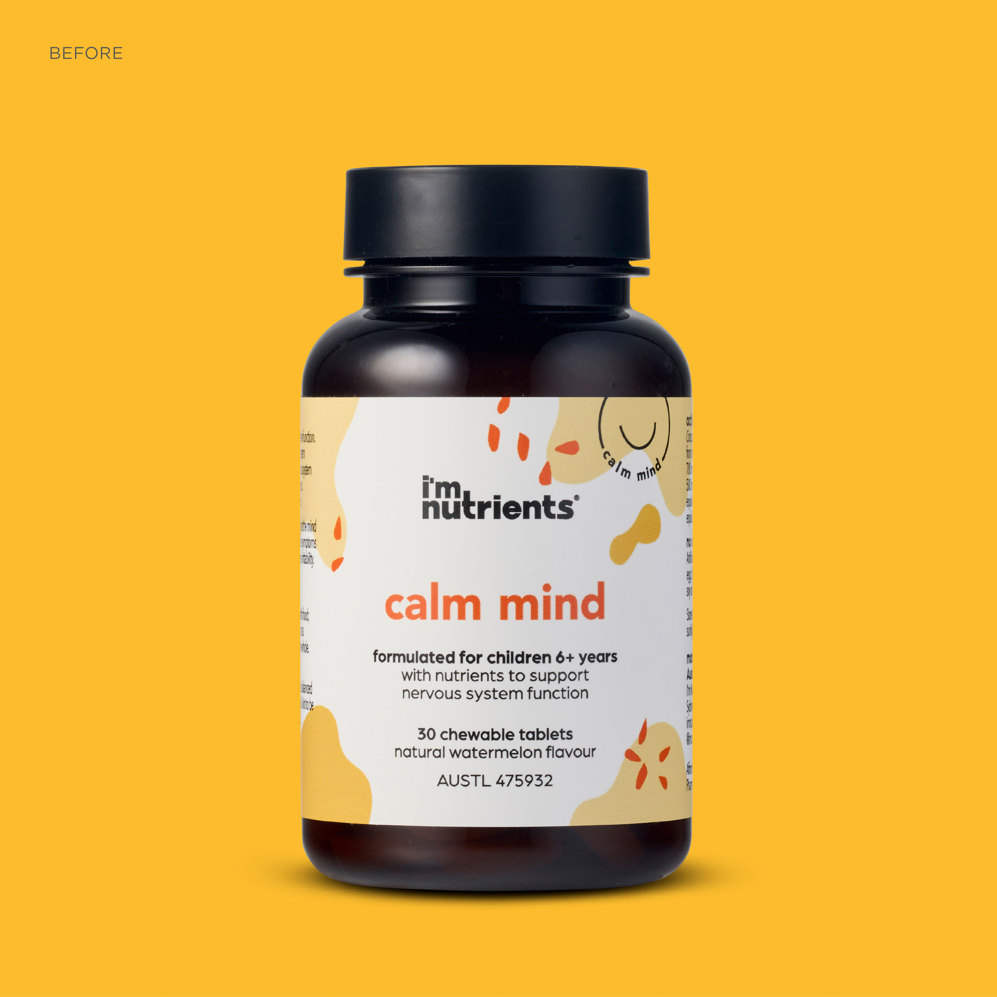
The original labels did the job for a direct-to-consumer brand. Up close, on a phone, with the product page beside them, they worked. On a shelf they did not. The benefit was buried under the product name, the age guide sat in body copy, and the ingredient story was nowhere on the front. Each product had been designed on its own, so the range never read as a range. The task was to keep everything parents already trusted and rebuild the hierarchy underneath it.
Design for the parent in a hurry.
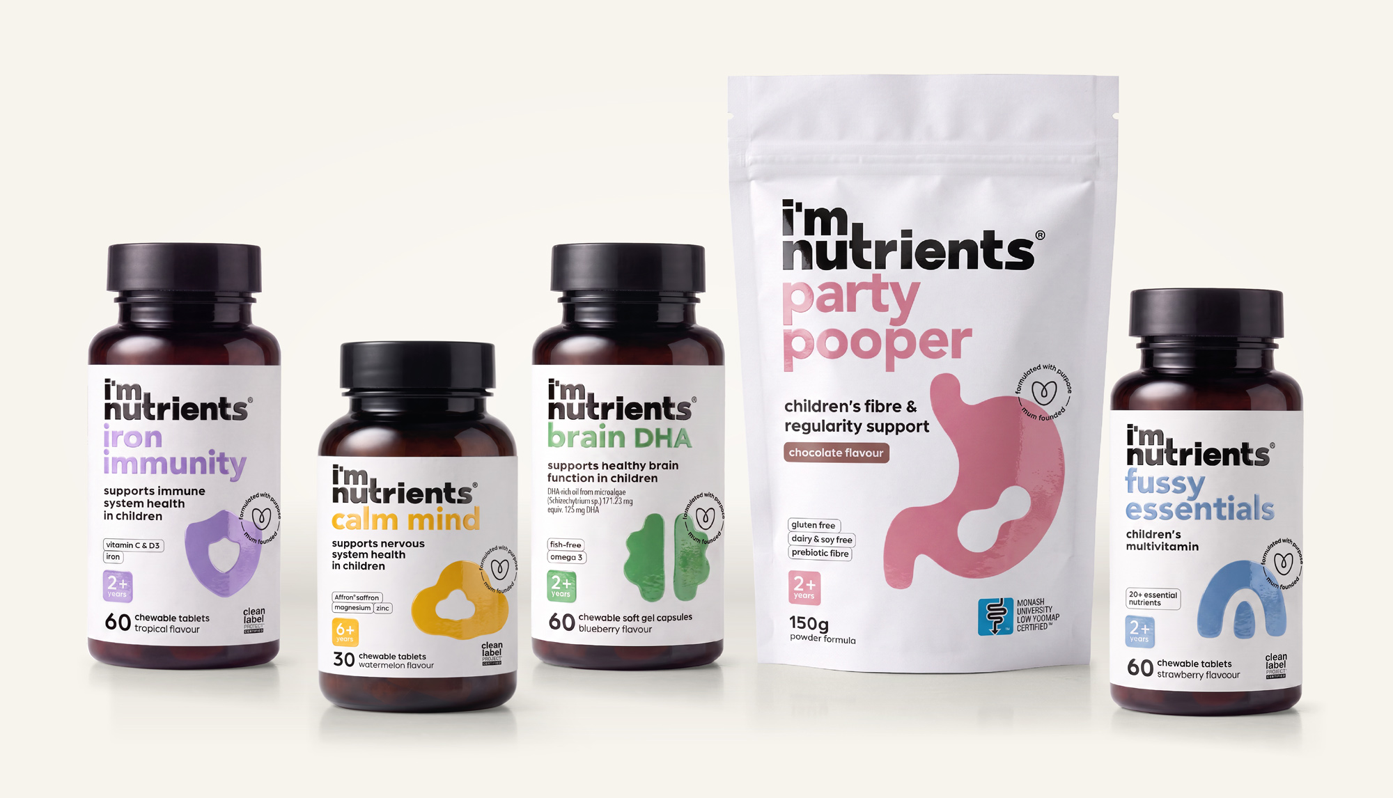
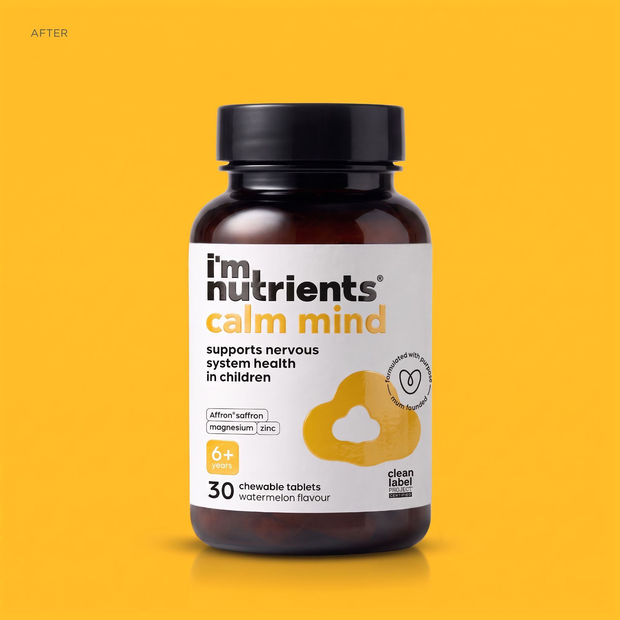
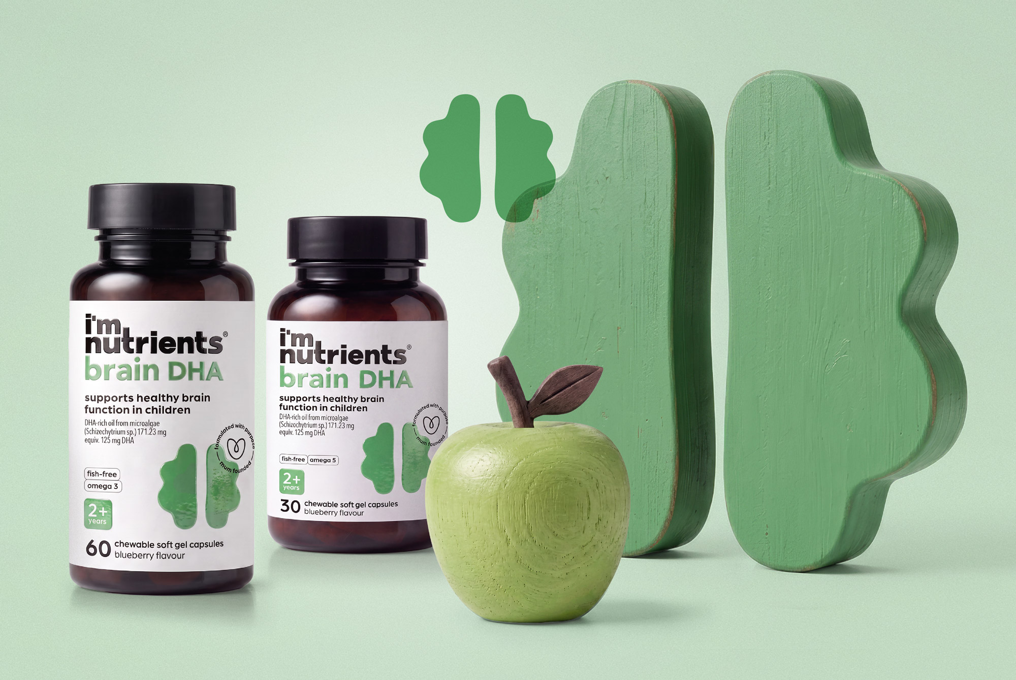
A parent buying a kids' supplement is asking three questions. What does it do, is it right for my child's age, and what is in it. The new label answers them in that order. The benefit sits directly under the wordmark in plain language. The age sits in a tab you can read from a metre away. The active ingredients sit in a row of pills, named, so the formulation does the selling. The mum-founded roundel and the Clean Label Project mark stay, because they are the reasons parents chose the brand in the first place.
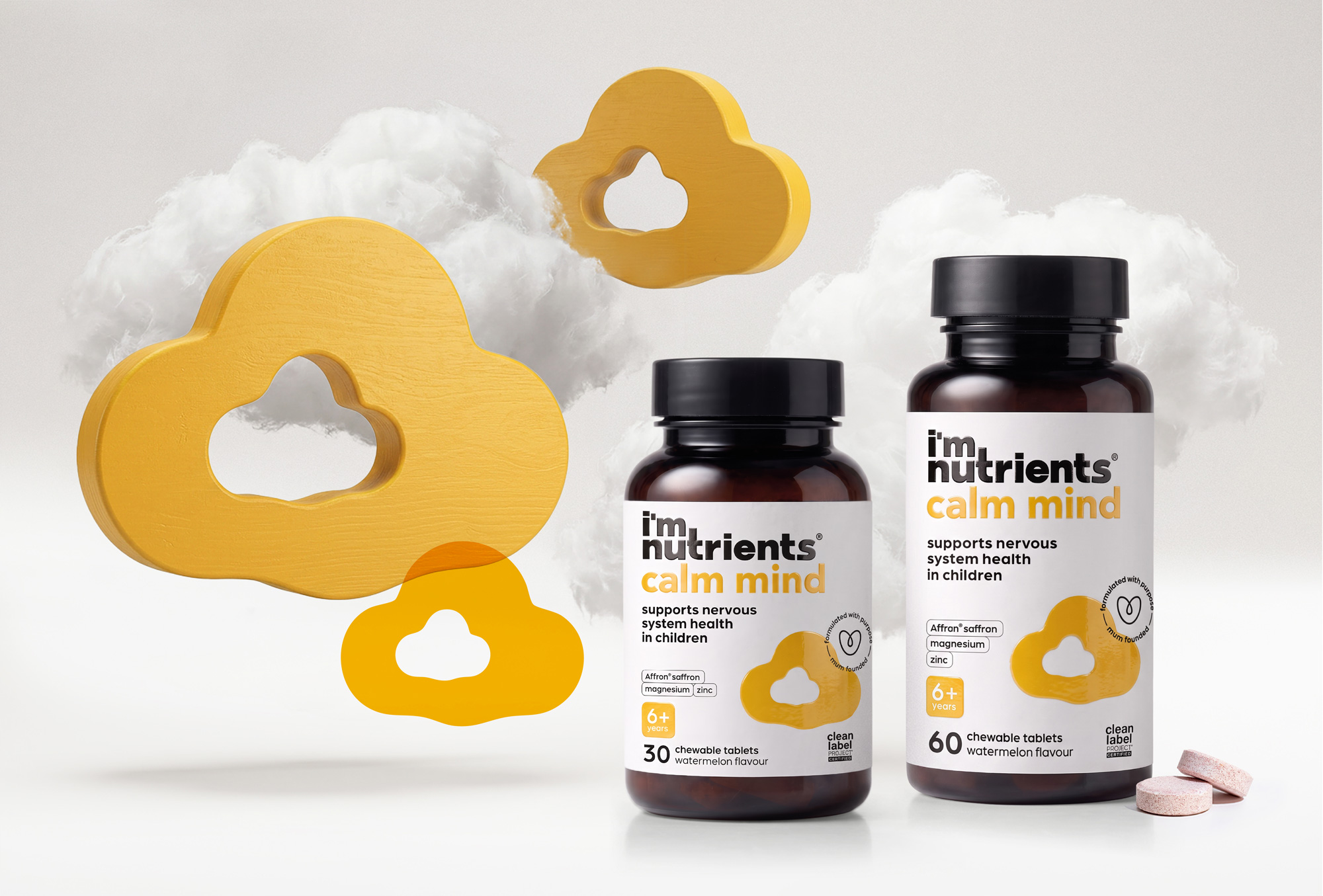
Five need states. One family.
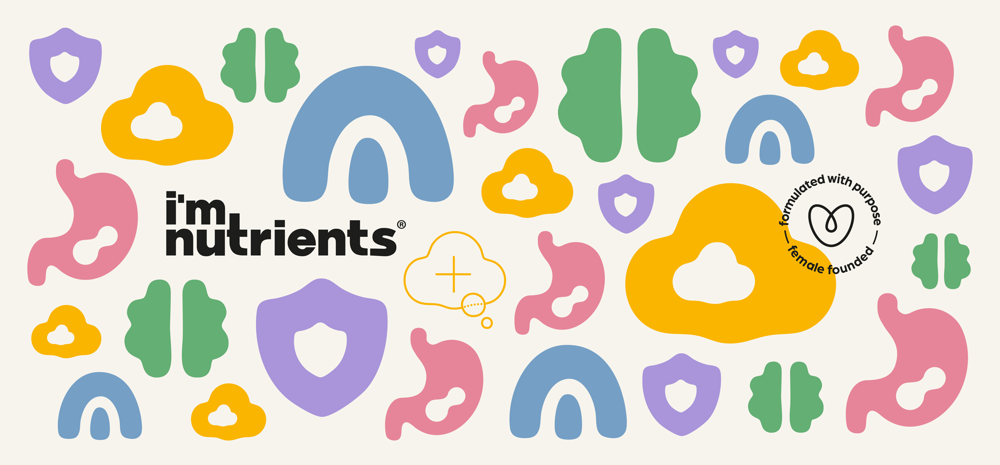
The refresh sets up five clear need states: immune, essential, calm, brain and gut. Each one owns a colour and an icon. Immune is a purple shield. Essential is a blue rainbow. Calm is a yellow cloud. Brain is a green brain. Gut is a pink tummy. A parent can find the right product from across the aisle without reading a word. Underneath, every label shares the same architecture. Wordmark, product name, benefit line, ingredient pills, age tab, format and flavour. The range reads as one family, and the next product slots straight in.
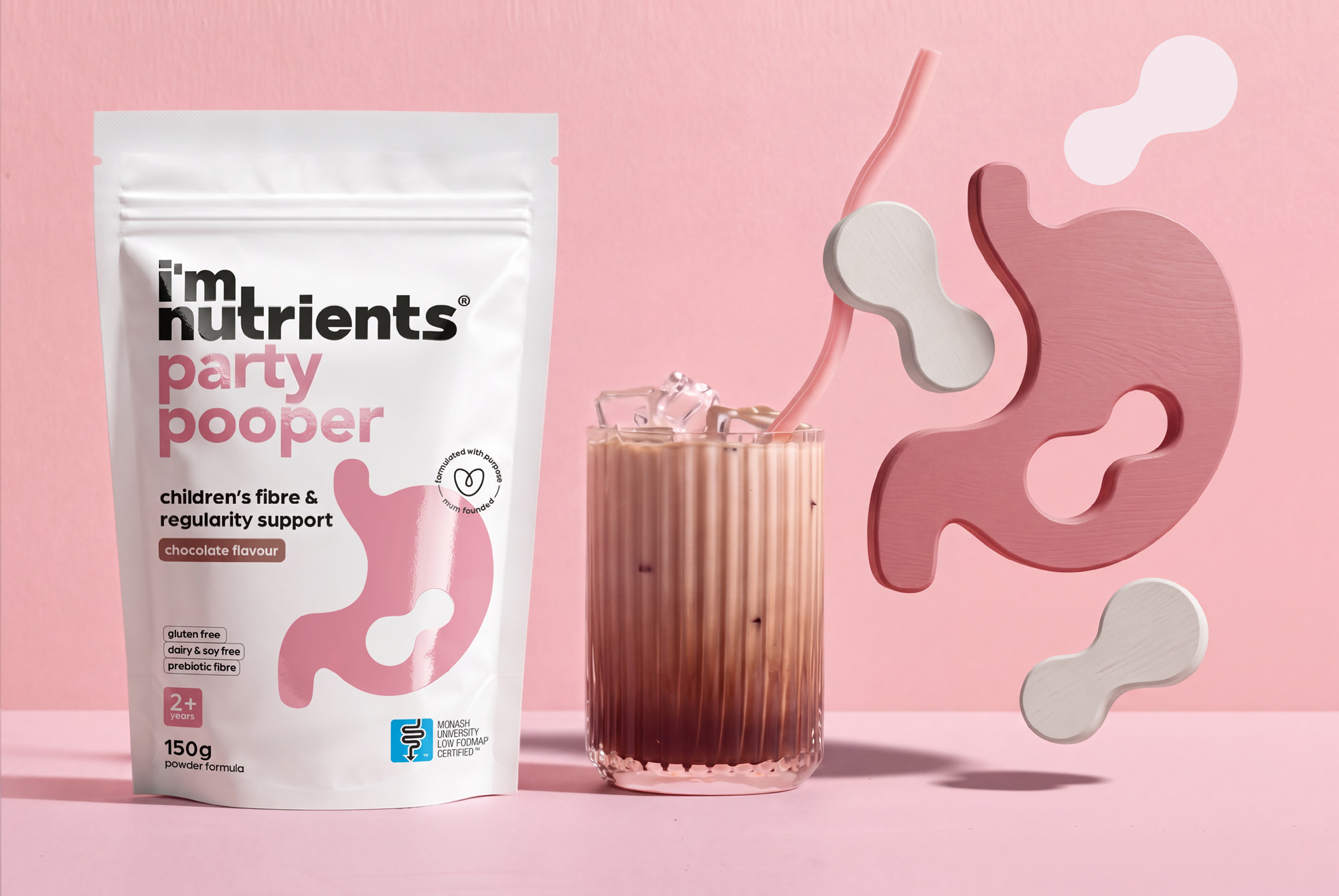
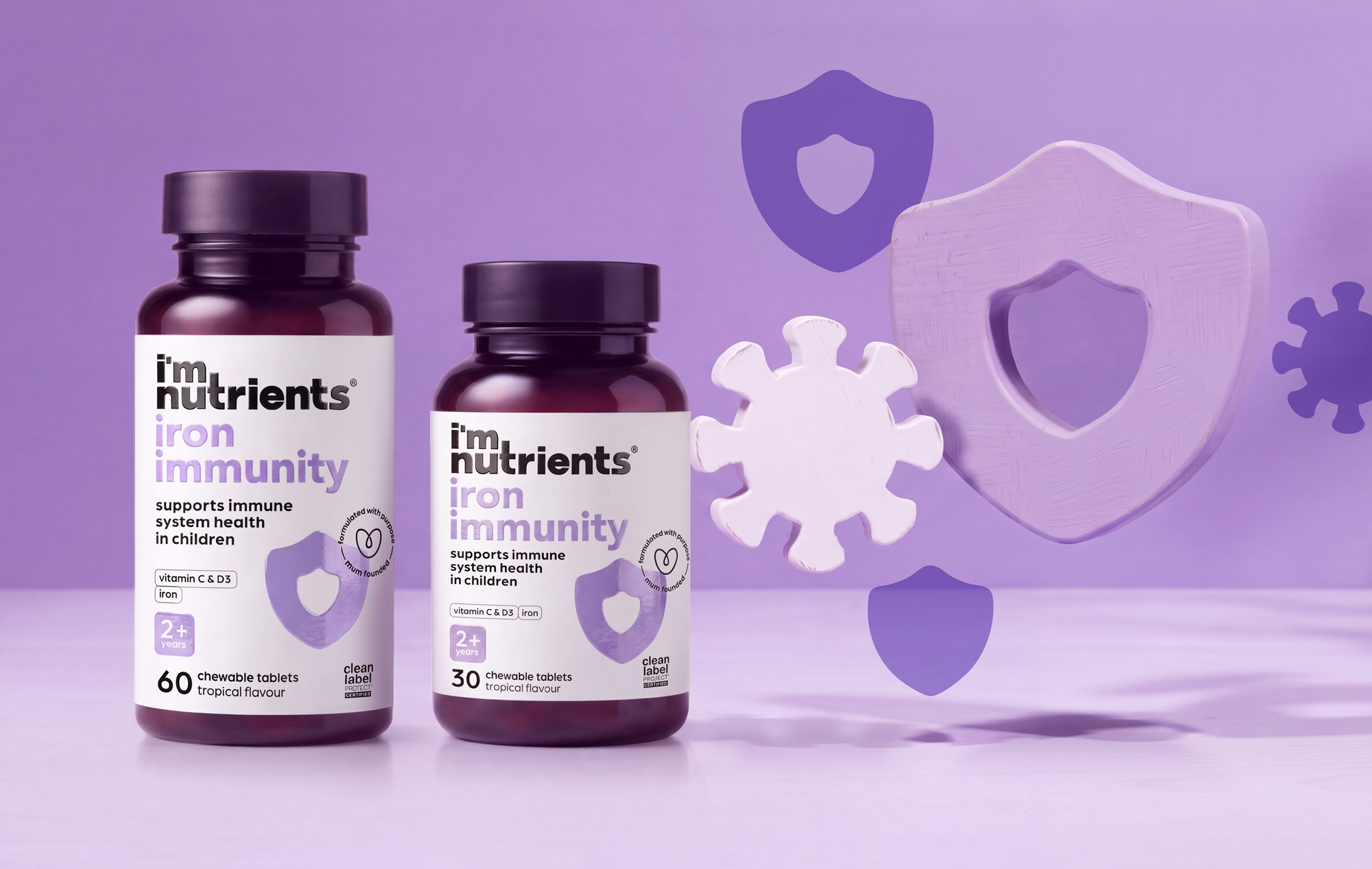
Building blocks.
The photography takes the five icons off the label and into the playroom. Each need state is built from painted, wood-cut play blocks and shapes. A purple shield for immune. A blue rainbow for essential. A yellow cloud for calm. A green brain for brain. A pink tummy for gut. It is a world kids recognise and parents trust, and it teaches the system without a word of copy. By the time a parent reaches the shelf, the icons already mean something.
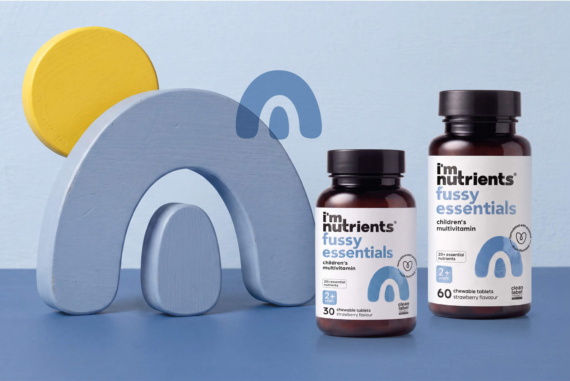
Ready for the next age.
The system was designed with the brand's future in mind. Baby and 6+ teen ranges are on the way, and the architecture already has room for both. Same structure, same five need states, a new look for each age. Baby gets soft pastel colours, gentler type and cute shapes. Teens get darker, more mature tones, linear illustration and full-colour labels. The brand grows up with the kids who take it.
“A brand parents already trust does not need a new personality. It needs a label that gets out of the way and lets them find what they came for.”