Every mark
tells a story.
A selection of logos and brand marks from twenty years of identity work, from start-ups to national brands. Every one starts with an idea, not a typeface. Hover over a mark, then click through to see it in colour and the idea behind it.
A refresh for Tasmania's iconic beer. Cradle Mountain captures the untamed wilderness and remoteness of the island.
See the case study →
A brewery that treads lightly: sustainable ingredients, sand-filtered for purity. The footprint says it all.
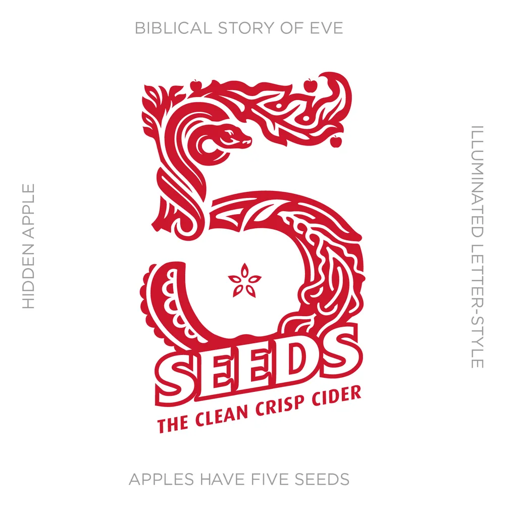
An illuminated 5 that hides an apple, its five seeds, and the serpent that tempted Eve with the forbidden fruit.
See the case study →
A refresh of an Australian icon, inspired by the four Xs once chiselled into the barrels to mark strength and quality.
Wine tours with wheelchair access built in. One mark captures the wine glass, the wheelchair and the comfort of a guided tour.
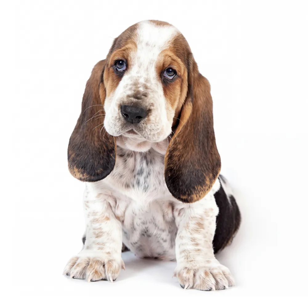
Dog treats made with 100% pure ingredients. Nothing added, nothing to hide: the hound is laid bare and becomes the mascot.
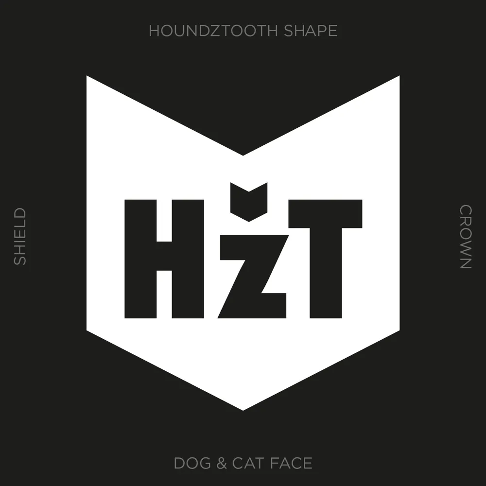
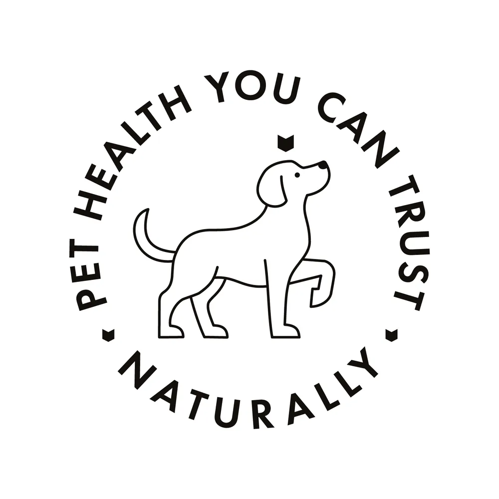
The houndstooth pattern reimagined for pet health. The shape becomes a dog's silhouette, with pointed ears and nose, and a shield that stands for quality.
See the case study →
A pioneer in pet health for over 20 years. The care it gives dogs and cats alike is hidden in the name itself.
See the case study →
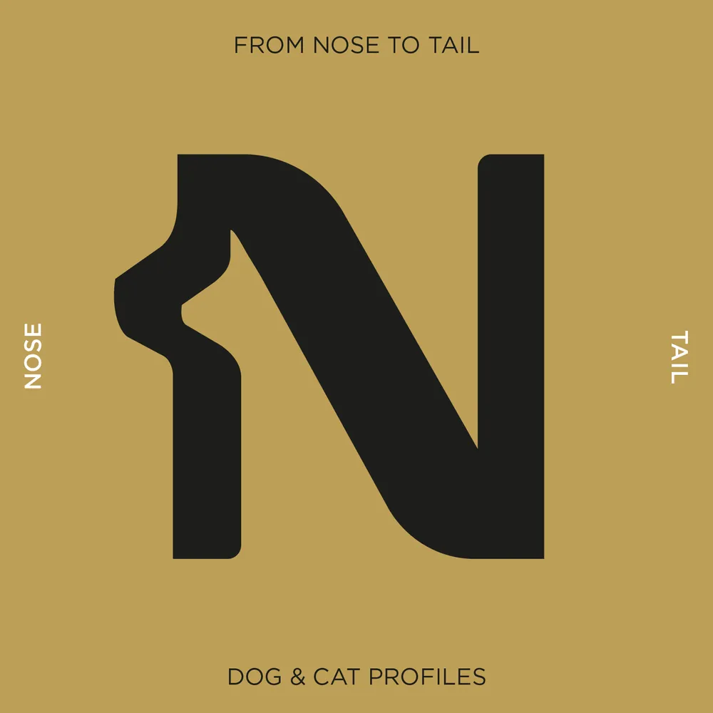
The N carries mirrored dog and cat profiles, from nose to tail. Just a hint of an ear and a nose: a blink-and-you-see-it reveal.
Horses, hounds and a trident, extended into the DigestiveEQ and DigestiveK9 ranges.
A premium exclusive for Petbarn, with a range for dogs and one for cats.
See the case study →

The heritage leaf, redrawn for an 88-year-old vitamins brand.
Collaboration with CowanSee the case study →
A cult tattoo recovery brand for 20 years. Cucumber is the hero ingredient, and the Dr knows best: number one in skin healing.
See the case study →
Coconut creams, milks, powders and shavings. The discovery: a palm tree hidden in the negative space between the m's.
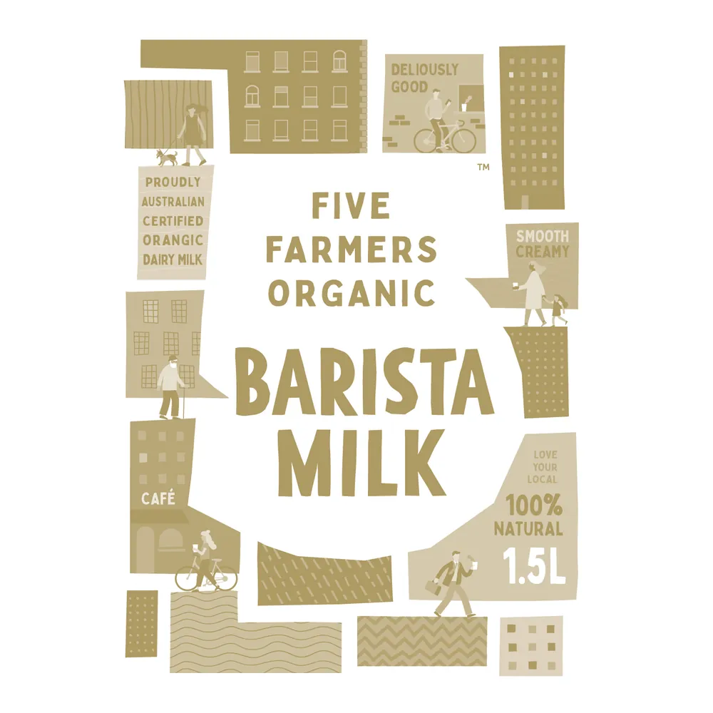
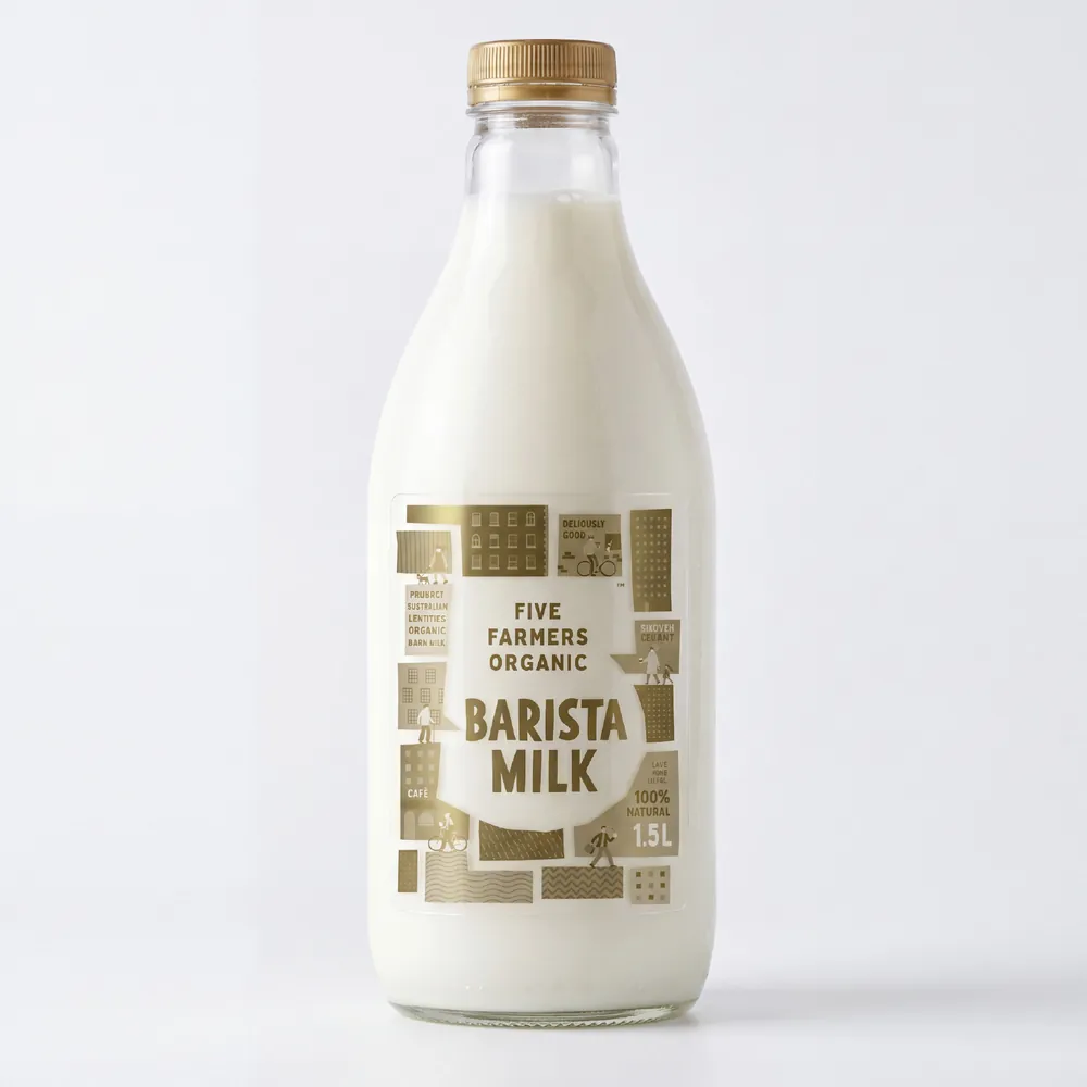
The farm seen from above, modernised into streets and buildings, for the cool cafés and restaurants it supplies.
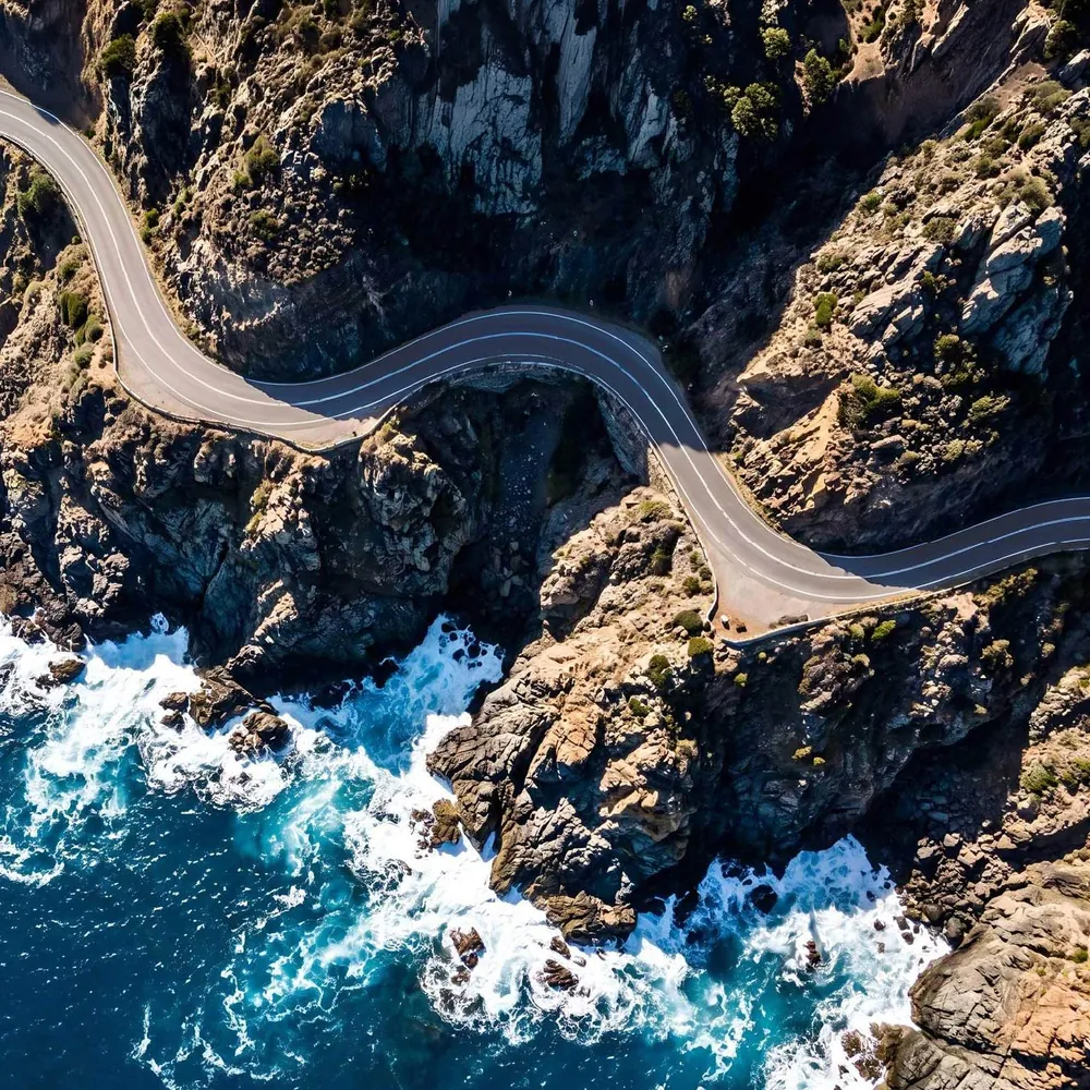
The mark reads two ways: the horns of the cattle, and the winding Great Ocean Road through the coastal country where the herd is raised.
Two words built from one set of strokes, so head sits on top of first.
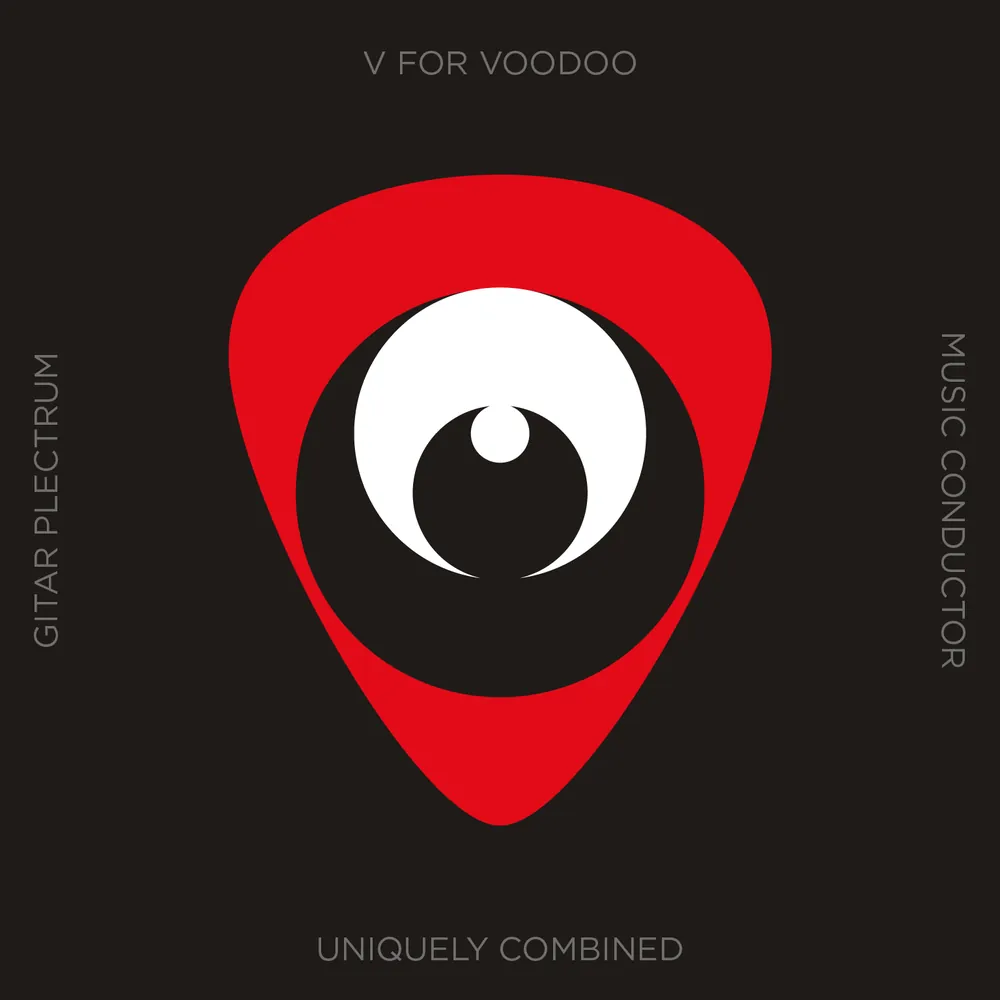
A guitar plectrum and a V for voodoo, combined into a single eye.

High-end menswear known for a tailored, fitted look. The X has a cut taken from it, like cloth cut to measure.
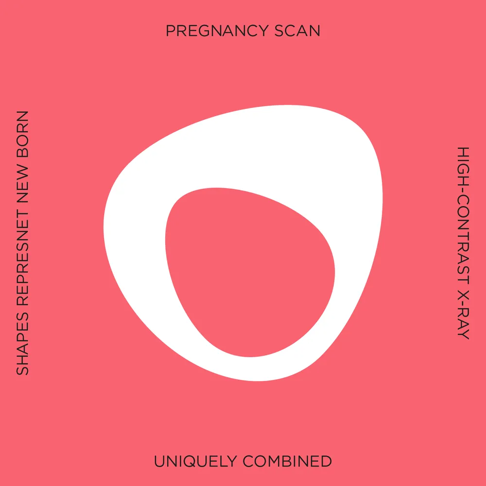
AI-enhanced 5D scans that show your baby as they'll look at birth. The egg shape is the newborn; positive and negative colour speak to X-ray and scanning.

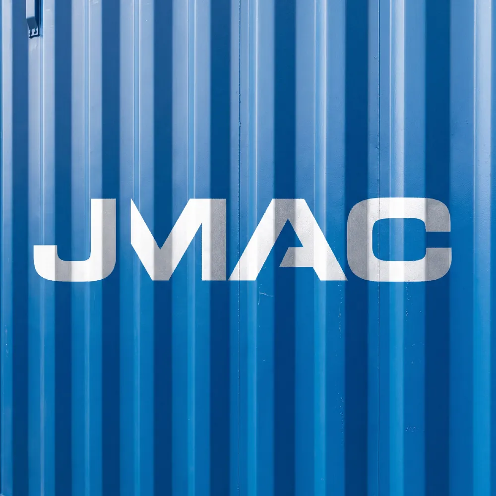
A marine logistics company, with letterforms stacked and locked together like shipping containers.
Stronger united. Three links woven into one A: linked like a team, strong as a chain, connected like a network.
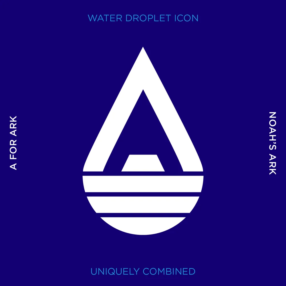
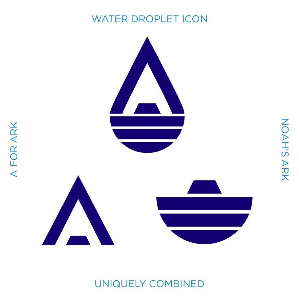
A for Ark, a water droplet and Noah's ark, combined into one mark.
A tough, practical wordmark for a hard-wearing floor range.
See the case study →
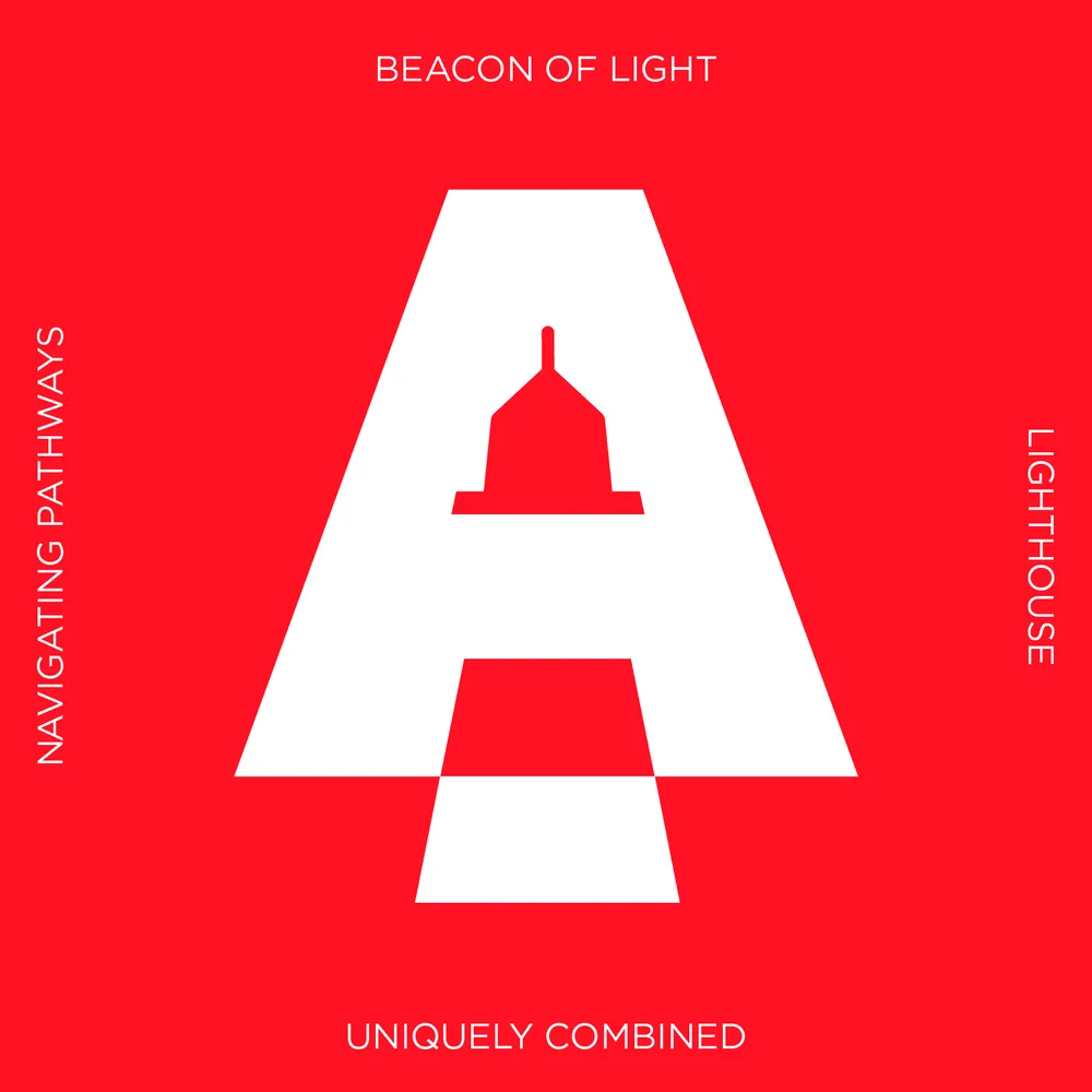
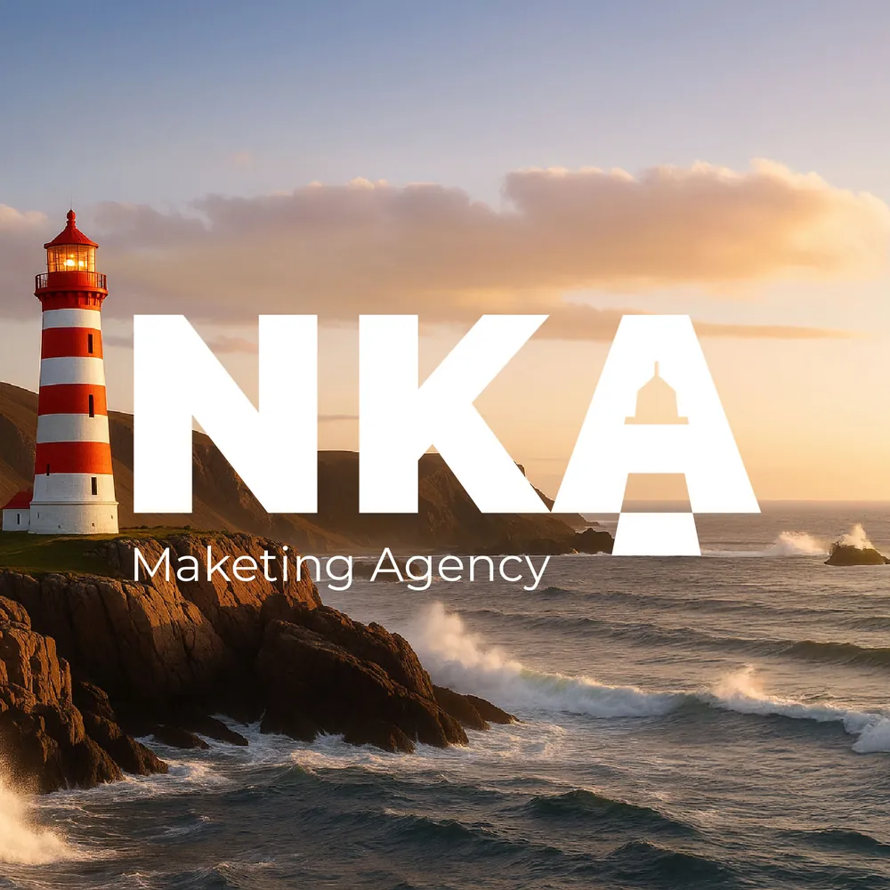
The A becomes a lighthouse: a beacon for brands navigating the noise.
See the case study →
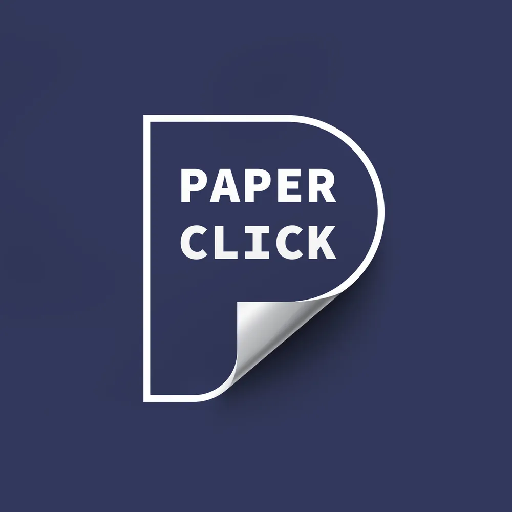
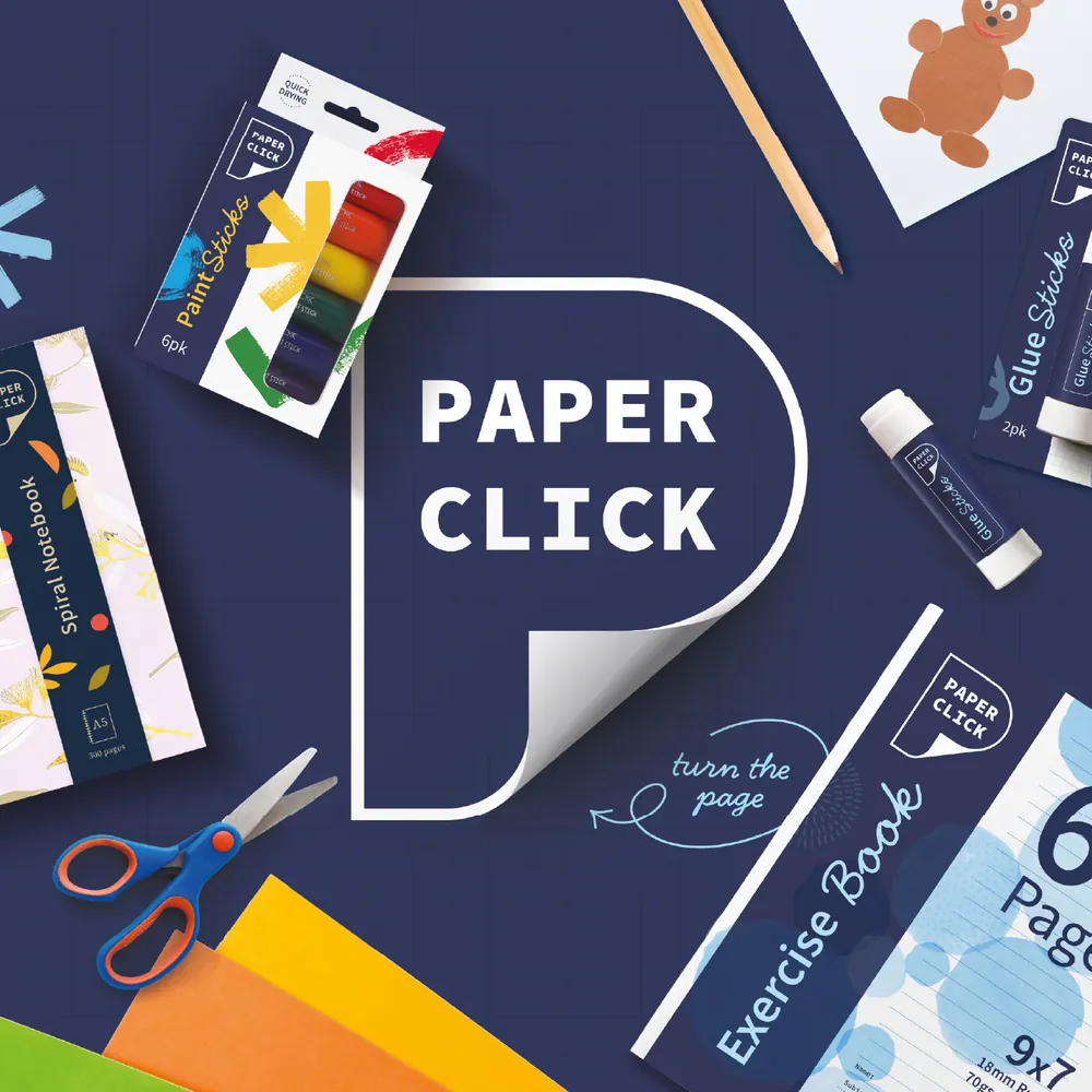
Woolworths' own stationery and paper range. The curl of a turning page reveals the letter P.
Collaboration with Boxer
Like the phoenix of myth, the mark rises from the ashes, reborn bold and confident for a new era of growth.